[For my Sisterhood of Snarky Stampers card, please click here.]
Some days it's just not worth getting out of bed. At least that's how I felt Friday night after I'd spent hours trying to make a card, and none of my ideas worked, so I got more frustrated, but because I'm so stubborn I wouldn't give up, so I kept trying different things, and I finally left in a huff with two cards, neither of which were what I wanted, but are passable. Do you have days like that?
This all started when a friend stopped by and left a few Newton's Nook cat sets she'd recently acquired. I immediately colored up these guys:
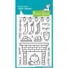
I thought I'd have them looking out a window, so I die-cut the window. Then I changed my mind and opened and used my Lawn Fawn Cozy Christmas set to make them sitting in front of a fire place. I opted to not use the Flame image included with the set, and instead opened and used my year-old Poppystamps flames and logs dies, and colored the flames with Copics. I liked all the dimension.
Here's the fireplace:
I only stamped part of it, because the original card it was on had a strip of pretty holiday paper down the left edge. I only forgot to mask it once when I stamped. ;/ Nice flames though, eh?
You'll notice I said "the original card". That's because I found the cats completely covered the flames. I just cut out the fireplace to try to repurpose it.
Eventually I admitted defeat and made two cards from the parts-is-parts I had. I went back to my original idea for a window and this is the cat card:
I put a piece of Lawn Fawn paper across the bottom as the carpet to ground the little guys. On a scrap, I laid down the window, added some sticky in each opening, and replaced the panes. I removed the window, colored the panes with Tumbled Glass Distress ink, then stamped a Paper Smooches tree over them. After I stuck the window to the card, I just placed the rectangles in the openings and I had an outdoor scene. I like it when something works, and this might have been the first thing yesterday.
The cats were placed so they looked out the window. I suppose I could have hunted for a teeny bird to sit in the tree, but I was pretty sure at that point I'd destroy the card, so I didn't.
The fireplace ended up here:
You may have noticed the top edge of the green layer is smaller than the other three. It actually started out the same size, but I thought I was following the current Friday Mash-up sketch:
so I trimmed it down. It turns out I only followed the sketch for the small panel, and not the whole card. I'm pretty sure this would disqualify me. Now I'm sad I trimmed the top edge. :(
So yeah, I was defeated at that point, and chose to call it a night. Hopefully I'll have better luck next time.
Thanks for stopping by!
PS: It's not that I don't like how these turned out,, but they are so far from where I started, I was just a bit perturbed. I'll get over it. :)
Some of the stuff I used: Copics (0, W0, N0, N1, N2, N4, N7, Y35, YR18, R14, R22, R08, BG32, BG15, YG41, G03), Basic Grey Basics White 6x6 pad, SU 2-way Glue Pen, SU Whisper White flock (cat's hat), and the following:
Pages
▼
Saturday, October 31, 2015
Sisterhood of Snarky Stampers Guest Gig
My third entry to the recent Sisterhood of Snarky Stampers challenge to make a b00b-related card won me a guest gig. Whoot!
This fortnight's challenge is to use cat images, with optional snark.
I have a vast cat image collection, so this was actually a tough choice for me. I decided to go through my older images and show one of them some love. Plus, most of my snark is in the form of wooden stamps (I've been collecting snark for a loooong time), so the cats and snark live in the same neighborhood.
Here's my card:
I thought I was being quite clever with the sentiment, since I successfully masked it and stamped it in two parts. I only forgot to remove the inky mask once. But I think it would look better without that busy background paper. I also added the strip of orange & green at the bottom to make it even busier. (In real life, the green in the paper matches the Sage Shadow layer.) I am not in love with this card.
So I made another one:
I went overboard in the other direction, and I think he's a bit boring. The cat here is stamped on a piece of Authentique paper and has a vintage-y pattern to it. I did this so I didn't have to color him. I also covered his shades with Glossy Accents. And I do believe in that sentiment.
So, two cards I don't love, but they both have cute cats and snark, so it was a good day. :)
Thanks, again, to the Sisterhood of Snarky Stampers for selecting my b00b card. It's an honor to play with such snarky women.
And make sure to stop by the Snarky Stampers blog and play along!
Thanks for stopping by!
Edited to add: The Cat Lover's Blog Hop has been extended through the weekend, so I'm entering one of my cards.
Some of the stuff I used: "Get a Cat" sentiment from River City Rubber Works, "Gag" sentiment from Viva Las Vegas Stamps, mad-looking cat from Penny Black (1999), Shades Cat from Eureka Stamps, paper from Basic Grey Max & Whiskers.
Note: No, I don't shop at all these stores. My LSS back in VA had the best collection of stamps I've ever seen in one place. I would go in, stop just inside the door, pick up a basket for my goodies, and work my way around the store. I almost always found new snark. I miss them so.
Thursday, October 29, 2015
Another Kindness Card
I don't usually make mushy cards, but the soon-to-be-released Hero Arts Kindness set has grown on me. I just used it again to make this card:
I followed the current Fusion challenge:
and included the poppies with the sketch.
My first thought was to use my Poppy die as the floral sketch element, and to cut an oval in the front panel. For a subtle background in the oval, I used another of my Gelli plate pieces I made last month. There is some shimmer in the Gelli piece you may be able to see here:
Or not. I think this is the second impression from another printing, so it's quite light. I love that you can get a second printing and use up the remaining paint. Cleanup is a breeze!
I cut a black oval frame for the opening using two sizes of Spellbinder's Petite Ovals dies. I colored the poppy die-cut with Copics, then stuck it to the front of the card, overlapping the oval opening.
I used my MISTI to line up the sentiment. I didn't want to lose all my hard work, and I know me pretty well: I'd totally stamp it crooked if left unattended. Plus, the sentiment overlaps the poppy's stems, so I needed to be able to re-stamp if I didn't get a good impression. I did end up stamping it twice.
I like how this turned out!
Thanks for stopping by!
Update: This card won an Honorable Mention at the Fusion challenge! Whoot!
Some of the stuff I used: Copics (R08, R14, R21, G24, YG63) Spellbinder's Petite Ovals (large and small), SU black card stock, Gelli plate panel, Memory Box Prim Poppy die, Hero Arts Acts of Kindness stamp set, MISTI.
The Hero Arts Acts of Kindness stamp set will be available Nov 1st. Please follow Jennifer McGuire's blog for the details.
Wednesday, October 28, 2015
CSSC #9 WINNERS
Thanks to everyone who played my last sketch challenge.
Note: I've decided to update my challenge rules to allow links to up to five challenges instead of three. I've seen too many awesome cards that went over three links. I only have a limit because some people link to 75 challenges (yes, I've seen it). Just think how many cards you could make in the time it takes you to link to that many link lists!
Here are my winners:
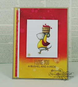
The "Top Cat" goes to Lee Ann with this entry:
There's something about the colors, and that mouse! Great blending, too!
The runners-up are Cat:
Great coloring, and I like the narrow strip of gold where the orange and white meet.
and Chris:
Love the tea pot and the textured card front, and those are great feminine papers.
Congratulations, ladies! Feel free to grab your badge from the CSSC Rules & Badges page, and display it proudly on your blog. You've earned it!
And Lee Ann, please contact me (email in the right side bar), to claim your prize!
I'll be back on the first with a new sketch!
Thanks, again, for your support! xo
Tuesday, October 27, 2015
SOS #225: Go Paperless
It's Tuesday, and time for a new challenge at Shopping Our Stash. This week's theme is Go Paperless, and we'd like you to not use any patterned paper. This is a great opportunity to either stamp your own background, or water color a background, or paint a background, or emboss a background, or leave it nekkid!
I chose to play with making a plaid panel, and this is what came out of that effort:
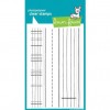
The plaid was made using two stamp sets and four ink colors (three blue-greens plus black). I have two long acrylic blocks, and a few stamp sets with stripes. I put two stamps on one block, one on each side, and far enough apart so they didn't interfere with each other when I stamped. The second block got stamp #3, which was a backward-mounted stamp so I could use the back of it for a wider, non-patterned stripe.
I stamped each color twice - once horizontally and once vertically, then changed colors and stamps, and repeated the process until the panel was full. When I was done with the greens, I used a Lawn Fawn image that has a dashed line down the middle and solid lines down the sides to stamp over the green pattern in both directions.
So I had a plaid panel, big whoop. Now what could I do with it? I dug through my print-outs of challenges and found this one from Match the Sketch:
I only used one circle where they have two half-circles (wait, two halves equal one whole, so I'm good, right? :)) I used one of my Party Grumplings in my circle. Sad story: I played around until I figured out how to mask his party hat so it wouldn't stamp, then I drew in the top of his head. As I put away my stamps, I noticed my other set of Grumplings has the image without the party hat. DOH!
The sentiment is from my collection of irreverence. I know it's not politically correct these days to tell someone to effectively "snap out of it", especially with the plethora of discussions about depression and mental illness. But I have the stamp, and I used it with a Grumpling. I may not use it again, though.
Note: the schmears on the letters are part of the stamp. It took me forever to figure that out way back when I first acquired the stamp. Usually it is me schmearing things.
I'm kindof happy how the plaid turned out, even if it's a little crooked. I have a reputation to uphold, you know.
So, I think you should play along with us this week over at SOS. :) And please make sure to stop by the SOS blog to check out the fabulous creations by the rest of the DT.
Thanks for stopping by!
Stuff I used: Neat & Tangled On The Strip 2, sentiment from River City Rubber Works, Copics (0, RV11, C0, C1, C3, C5), and the following:
Monday, October 26, 2015
More (gah) Pink
I do believe there are forces in the universe that are pushing me towards the dark side, also known as a world in which (gah) pink is easily accepted. THIS IS NOT MY WORLD! *ahem*
Please allow me to share Exhibit A:
This was in a parking garage this morning. The place was parked up to the roof, which is why you can see sky. They tortured me with having to remember I was on the Pink level. ;/
It's a conspiracy, I tell you.
This afternoon I decided to play a difficult color challenge from Color Throwdown. Difficult, because one of the colors is (gah) pink:
I spent hours making my three cards (sob story to follow), and when I went to link up just now, the collection was closed. I missed it by an hour. Sigh.
So I'll only need to do one blog post since I'm not linking up all of these cards to the same challenge. I'm grateful for the little things.
May I present my first card:
This is the third attempt. I first tried using the negative of the die-cut to line it up, but it ended up as a sticky mess. I suppose I should have used a piece of double-sided adhesive, but that would have required clear thinking.
In the end, I lined it up manually. I DID! *so proud*
The card follows the sketch from Less Is More:
I knew I wanted to use part of that Graphic Twist die, but I didn't plan on it taking me hours to get one right.
Since I had to cut the die so many times, in different colors, I took advantage of all the parts-is-parts and made two more cards.
Here is one of them:
This is the whole die-cut shape. And no, I didn't magically get it all straight. I used the negative of the die-cut to line things up and mark the spots, then I removed the negative and glued the pieces down. Thus I maintained my crooked status.
Dang. I just noticed I applied my top colored strips wrong. #FAIL *weeps softly*
I also made a black one, because I could:
I was consistent in applying the top strips in the wrong order.
I like the contrast here, but I don't like that I'm a bird-brain. See that Happy Birthday? I'd originally stamped it directly onto the card front. Even used my MISTI to get it straight. Then, like an idiot, I clear-embossed it instead of using white. DOH!
I was not starting over! So I white-embossed the sentiment on a small piece of black and stuck it over the clear one. Sigh.
I may never use this die again. You may see it for sale real soon.
I need wine.
Thanks for stopping by!
Some of the stuff I used: PBS sentiment from Viva Las Vegas Stamps, card stock remnants, SU 2-way Glue Pen, and the following:


