(You are welcome for that ear worm.) I don't know what came over me, but the other day I decided to scroll through my cache of digital images. I used to play the Hambo challenge every week, and I have a ton of their digital images. I pretty much stopped using digital since it means you have to color, and I am not a big fan of coloring. Then there's the whole "get to the printer, put in card stock, fight off the cat who's trying to help" part that smells of work.
So what did I do? I selected an image, sized it so six - SIX - fit on one page, trudged into the other room where my printer lives, put in some card stock and printed the thing. Then I put it on my craft desk from whence it taunted me until I used it yesterday.
I did it. I die-cut the images and started to color them. It took me ALL. DAY. WHAT WAS I THINKING?! Apparently, I wasn't.
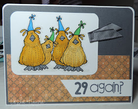
Here is the first card:
I do love these birds, even though I can't color. If I'd been thinking clearly, I'd have printed them again on patterned paper and cut them out. Sigh. For the first image I used YR23 and YR24 to color the birds, and I thought they were too dark. I switched to YR23 and Y23 for the rest of them.
This card got a piece of ribbon stapled to it since ... well, this is a long story. Let's just say I did a poor job of removing some washi tape and I tore the card stock. Remember: there are no mistakes in stamping; only opportunities for embellishment.
The patterned paper was from The Heaplet, or maybe from unpacking a box, I don't even remember. But the pieces of paper have been on my desk for a week or two, and they were driving me nuts, so I used them on these cards. I didn't even bother to trim them to the same size, which you'll see momentarily.
Here's one with the lighter colors of yellow for the birds:
The yellows, side-by-each:
It's a subtle difference, but I do like the lighter version better.
You'll also notice I colored the hats differently here. In the first image the lower floofy bits are colored yellow, as I declared them to be feathers sticking out from under the party hats. In the second one I declared the floofy things to be part of the hats. I'm still not sure which way I like them better.
The sentiment is (sentiments are) embossed, mostly because I could:
I might be in love with the Memento Luxe inks. Just sayin'.
I used a different sentiment on one of the cards, since I needed one to include in a box I'm shipping out:
This card also has a different bit of that patterned paper, just so you know I didn't make up that part.
I actually have a few more images printed, this time from Mo Manning. I love her stuff, but I still need to color them. Maybe next week.
Thanks for stopping by!
Products used: Hambo digital image: Silly Birds With Hats, clear embossing powder, SU Basic Gray card stock, misc patterned paper, SU Basic Gray taffeta ribbon, and the following:


Those birds are so cute! I like both versions and coloring them would be difficult. Stamping IS hard!
ReplyDeleteFantastic!! Love the image...I am at a complete loss with digital stuff and I also detest colouring...I do however LOVE your idea of printing them on design paper...brilliant!!
ReplyDeleteCute, cute, cute. the image and everything else too. I love your idea about the embellishment, so true in the crafty world.
ReplyDelete