As I cleared off my desk this morning, I purged the bottom few inches of printed-yet-undone challenges, and set to work on some more current ones. I managed to combine three challenges again into one card - whoot.
Here's my card, then I'll explain:
I took the current sketch from Retro Sketches:
and added the December OWH ODBD challenge to use primary colors, and the December OWH Mid-Month Throwdown to make a Miss You card.
A few words about the OWH ODBD challenge (from the OWH site): Each month that we reach the goal of 50 entries, ODBD donates up to two boxes of free shipping for our heroes–1 for 25 cards posted and 2 for 50.
As of today, Dec 22nd, there are less than 25 entries! Ack! Maybe after the holiday more people will link up with primary colored cards.
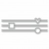
Okay, back to my card. I die-cut some squares with my Lil' Inker Stitched Mats: Squares dies out of some miscellaneous red, white, and yellow card stock that was lying next to my paper trimmer. I stuck the white square into the red one on my white card base, added a piece of blue washi tape for the horizontal element, and topped it with the yellow square.
Since this is for OWH, I couldn't really use a button, so I used one of the left-over die cuts from some previous cards. I trimmed the white piece to fit, then die-cut a red heart from the same red I used for the square.
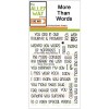
For the sentiment, I opened and used my new More Than Words set from The Alley Way Stamps. I love the font! I also hacked the sentiment into two parts so it worked on my small square. I stamped it in Hero Arts Navy ink.
I'm happy I used so many parts-is-parts from my desk and cutting area to make this. :) I'm off to link up.
Thanks for stopping by!
Stuff I used: mystery red and yellow card stock, blue washi tape, and the following:


Cute card! Love the design, especially the rugged washi tape! TFS!
ReplyDeleteThat's a sweet card. I like the layout and the front panel at an angle.
ReplyDeleteDenim print washi tape?
ReplyDeleteBitch.
I love this clean CAS card. I like what you substituted the button for. Buttons are too bulky in the best of times I feel.
ReplyDeleteSuch a fantastic card, love the washi and every single thing about it. Nice!
ReplyDelete