Monday, March 28, 2011

And a Ballerina

Don't close your browser! You are really reading The Crooked Stamper blog, EVEN THOUGH this card is not only (gah!) pink, it also has a ballerina on it. Yes, I know.

You see, a while ago I got this crazy idea that maybe I should try to make a girlie card. I mean, I'm branching out in other areas (and I don't mean my waistline, but, well, never mind) so why not try pink and girlie? I got this ballerina stamp with one of my Hambo Stamps orders, and I just now used her. Check her out, then we'll talk:

I can't do girlie. It's (more gah!) pink and froo-froo-y and ruffle-y. You may recognize the layout from night's post about this week's Hambo Hoedown sketch. I had originally planned to use this stamp for that challenge, but I decided I liked the dog better. Tonight I finished up the coloring on my ballerina and selected papers from my Basic Grey hopscotch 6x6 paper pack.

The sentiment ... I am very proud of that. You see, I knew I had a stamp that said "sweet", but I could not remember which set it was in. Then I remembered several years ago I'd made this book:

You can tell how old it is by the stamps and papers. 2007? This is an index of all my SU sentiments at that time and what set they were in. It worked until I bought more stamps and stopped updating the book. HOWEVER, I flipped it open to the S's and lookie:

I could tell from my scrawl that the "sweet" stamp could be found in the So Very stamp set, and I made a bee-line for my sentiment stamp drawer (I have two, actually. Sentiment drawers. Yes, it's sad.) and found the stamp.

For bonus points, I stamped the sentiment in my NEW Hero Hues Cerulean (blue) ink. If I fall any more in love with this ink, I'll need to build movable walls in here like that guy in Hong Kong so I'll have room to STORE it all.

On that note, I think I'll take my leave. Thanks for stopping by!

Sunday, March 27, 2011

Hambo Hoedown #8

I have fallen behind on my challenges, and I'm trying to get back on track. I think it helps stretch my imagination and creativity, and I use some of the crap stuff I have in The Captain's Quarters, currently clogging my floor. The paths, they narrow.

When I saw that this week's Hambo Hoedown challenge included a sketch, I had to do it. Since I didn't play last week, I didn't get the free image, but never fear! I have a bazillion Hambo images, both digital and rubbah, so I was cool.

Here is the sketch:

... and I used their Drooly digi of a cute dog and two sentiments to create not just one, but two cards. Here is the first one:

I took a few liberties by using an oval instead of a circle, and I put ribbon through the "dog tag" sentiment. The papers are Basic Grey max & whiskers. I love that I can pick out any papers and they just work together. I colored the dog with Copics, and used a silver glitter pen for his tag, and a clear glitter pen for his drool.

Okay, how many of you have been slimed by a drooly dog? *raises hand* Hey, it happens, but it's done out of love, or begging, or "you are sitting in my spot so I'll lay my head in your lap". I thought he liked me, but his owner told me I was sitting in the dog's spot. I didn't wear those slacks again that weekend. Ew.

Since I had to print the dog and sentiment, I went ahead and printed him twice and also printed both sentiments. It was the most efficient use of that piece of card stock, plus I got two cards instead of one. :) There are a LOT of dog people at my markets, so I hope this one sells.

The second card is the same as the first except for the background color and, yes, the sentiment:


Hee hee. I think he's a cutie.

Okay, off to post this to the Hambo Hoedown site and catch up on some laundry so I can go to work tomorrow.

Thanks for stopping by!

EIC 132

For this week's EtsyInspired Challenge, we were supposed to select an image from Fresh Metal Jewelry's shop and use it as inspiration for a card. I selected this photo:

... mostly because I still have out my MFT rolled roses die and some felt, and I wanted to try my hand at a few more of the roses.

Also still out on my desk (surprise) were my Memory Box minuet papers, and I used remnants from previous projects (I store them in the handy cellophane package to keep them with the original pack of papers) to make this:

Can you tell that birthday stamp was still out on my table, too, from making my previous card? :/

So I pretty much "copied" the flowers for my card. I wanted to add silver pearls to the flower centers, but I don't own silver pearls, yet, so I couldn't. After-the-fact, I thought I could have used brads, but it sounded like work, so I didn't. I think it's still okay without them. Oh, the dark green leaves stand in for the darker green ribbon in the photo, and the SU Basic Gray ribbon would be inspired by the rocks. (Psst: I straightened the ribbon after I took this photo.)

One more challenge done. I'm off to stamp some more. Thanks for stopping by!

Sketchy Sunday {TG013}

Creative Avoidance is in full swing at the Crooked abode. I got totally distracted when, in a futile and hopeless attempt to keep up with my Google Reader backlog (I keep adding more blogs ... this is not good), I saw Tiff's Sketch Sunday post for this week:


I thought about baker's twine, but then I saw Tiff used that, so I came up with another plan: open and use my MFT banner die, so I did! I flipped the sketch to make banners work better, and this is what came out:

Those tiny strips of paper at the bottom are punch-out parts from die-cutting the banners. I call it my stand-in for the "row of stars" on the sketch. For my circle element, I used a PTI button, and the sentiment is A Muse.

That lame-o tied stuff in the button was my first attempt to use Scrapper's Floss (from Karen Foster). I need more practice. Other than that, I think this is a fun card for a girl's birthday. :)

Off to craft some more. Thanks for stopping by!

Saturday, March 26, 2011

Jingle Belles Rock - Week 13

This week's challenge over at Jingle Belles Rock is called Holly & Ivy. In their words, "incorporate holiday foliage into your masterpiece. this could of course be literal holly and/or ivy; but then there's mistletoe, too, and did you know that poinsettias--whether red, white, green or even PINK --are all actually considered leaves and NOT flowers?"

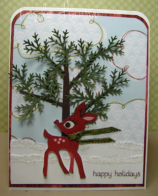
Then we have MY interpretation of "holiday foliage", which I streeeeeeeeeetched to include the greenery that people use to adorn their homes. You know: greens, like evergreens. Mmm-hmmm. Which brought to mind this punch:

I own this punch. I have never used this punch. I used it today and called it "evergreens", which only adorn people's homes during the Christmas season. It totally DOES count. So here's my card:

So I had this idea ... there it is again ... to use punched-out fronds, if you will, to build an evergreen tree. I cut strips of dark brown from a scrap for the tree trunk and branches, then stuck the fronds to it and called it an evergreen tree.

The cloud paper is a piece I, um, may or may not have bought today at my LSS and needed to justify its purchase. The deer is cut from a piece of paper from the Basic Grey eskimo kisses 6x6 pack. I almost used him last week, so he was still in my frontal lobe.

The really fun part of making this card was the collaboration with my tweeps, as this was the second card I made while live-streaming my crafty table today. They suggested the deer in front of the tree as opposed to the right side (where I had him). We also discussed scarf options, well, when they weren't discussing other things amongst themselves. I think I lost control of my chat about 3 or 4 times. And once they yelled at me because I wasn't paying attention to the Chat room. They are a tough crowd.

That's it. That's all I have to say about this card, except that it was fun to make! So if you haven't already done so, check out the Jingle Belle's blog and play along!

Thanks for stopping by!

Sketchy Sunday {TG012}

Another sketch done at the last minute. GAH! I collect sketches all week long, and on Saturday I look at the pile and have to triage before the next wave of inspiration-y goodness hits the Web. I wouldn't miss this one, though! This post is for Tiff's Sketchy Sunday {TG012} (that would be from last Sunday), and I've had this idea floating around in my head for a few days.

Today ... ah, today! Today I'd planned to live-stream my crafty table around 3 pm Eastern Time, and it took me over an hour to get it to work. Grrrrr. But when I did, I made this card first. Here is the sketch:

I saw lots of white space. I can't handle white space, so I used a pretty paper layer to calm myself. Here's my card:

I heat-embossed a flower from Fifth Avenue Floral onto Card Stock Vellum using Versamark and white embossing powder, then I cut it out. I looped the top of that white satin ribbon a few times to make it a little more interesting than just a flat piece of ribbon. After I stuck the flower onto the paper, I filled the center with pearls.

Here's a close-up view of the flower so you can see the detail :

And that paper? It's the sneak peek paper you can order during the month of April. I loooove that paper, especially the pieces with green and blue in them. You'll see more of that here this month, I'm sure.

Thank you, again, to all my tweeps who put up with me today as I tried to get the Web cam to actually broadcast. Now I know the secret: don't open the Web cam... let UStream find it.

I also made a second card for another challenge that I'll post next.

Thanks for stopping by!

Thursday, March 24, 2011

Moxie Fab: Tuesday Trigger - Citrus, Part Second

Because I don't know when to give up, I had another idea for the Moxie Fab World: Tuesday Trigger: Citrus challenge. Here's the inspiration photo again:

So I had this idea (you know this won't end well, right?) to use baker's twine as my color. I remembered seeing a card made with just a few rows of several colors, so why not try the three citrus colors? So I tried it:

Okay, yeah, I went a little over-board and wrapped it waaaaay too many times, and waaaaaay too tight, too. The top white layer is totally puckered, and I have half a pack of Dimensionals holding it in place. Last night I mentioned an itch to color the tree, so tonight I did that, too:

And as a bonus, I opened and used a pack of orange bling I had to buy. I think I might have gotten two, because together they were still under $1.00. Do I ever use orange? What, exactly, is your point?

Oh, I'm supposed to include a statement about what from the picture inspired me. Well, the colors. I never. ever. use. these. colors, which is why I have so much of them left in my Retired Card Stock Colors stash. And now, between the two cards, I've used the equivalent of about 1/2 of a piece of colored card stock. Yeah, at this rate ... remember that SABLE thing? Mmm-hmmm. I'm there.

So now I'm off to see if posting a second card to the challenge will disqualify me completely. I'm actually okay with that if it does. I will be back for more challenges one way or the other. :)

Thanks for stopping by!

Wednesday, March 23, 2011

Moxie Fab: Tuesday Trigger - Citrus

When I saw this week's Moxie Fab World: Tuesday Trigger - A Citrus Celebration:

I knew I had to do it. Why? Because I don't use bright colors much, so it would be a true challenge for me. I also wanted to CASE, er ... be inspired by this card on Simplicity to use some of my hoarded retired SU colors. First, I did my CASE:

The images are from a Hero Arts set that I had to have, but just now opened to make this card. I can now put it away and get it off my desk. (bonus!)

Then, because I'm lazy, I made a second CASEd card and added another layer of color to meet the Citrus challenge:

"wimpy wimpy wimpy" Yeah, I know, I should have shown more of the orange and yellow, or even made it the focal point of the card, but I decided I wanted to be subtle, even though in the challenge inspiration photo they were quite bold and prominent. I thought about going back with some Copics to color the flowers in the tree, but nah, I'm leaving these two alone.

Oh, you noticed that thing stuck on my card? THIS thing? -->


One of the first rules of stamping is, "There are no mistakes in stamping; only opportunities for embellishment." THIS, my friends, was just such an opportunity. As I was attaching that white layer to the card front, I noticed I'd schmeared a bit of brown ink dead center where it did not belong. Then I remembered a package of these bumble bee buttons I had, um, "staged" in the kitchen, so I took a small one, cut off the shank in the back (yes, that is a technical term for the loopy thing on the back of a button ... I am just full of useless information) and stuck it on with a glue dot. I don't like it, but it was necessary. I suppose I could go back and stamp a few of the leaves, cut them out, and use them instead. Or not. What I do know is I will NOT re-stamp that tree. Man, this is the 5th or 6th attempt, and I am done, done, done.

So there you have it - all the stampin' I have in me this evening.

Thanks for stopping by!

Monday, March 21, 2011

On Crafting Live and Re-purposing Stuff

I've mentioned before that my pal Lydia of Understand Blue will occasionally do a UStream broadcast of her stampy table, and people get to see the creative process real-time. It's fun because we can interact with her and make suggestions when she says, "It needs something ... black." We type into the chat area, and it's like we're all there! So Sunday, just before my Google Chat session with Lisa of Papergrace Designs, I test-drove UStream, and actually did a live broadcast for a few minutes. I had that date with Lisa, so I shut it down to chat with her, but I had a blast! And now that I know how to find the chat room for my own broadcast ;/ I hope to do it again this weekend.

What did I make? I made this card:

The stamps (Great Impressions) were a prezzie from Marianne of Paperplay@Ruff Haven, and I just HAD to use them. I thought that piece of colorful SU paper would be a perfect background for jelly beans, and you'll notice I got to use another piece of that Melon Mambo paper I have. I think it's a really fun card.

In other news, I've made a little (very little) progress unpacking the multitude of boxes I have in my Living Room. Remember the van I drove to Ohio and back and filled with boxes of stuff from my Dad's house? (He moved into smaller place.) One of the things I took was the contents of the forgotten "seasoning drawers". LOTS of bottles of spices. Glass bottles. I took the entire contents of these drawers.

A little aside: In the past I've talked about how my generation is confused. Yes, I think we are The Confused Generation. My parents were children of the Great Depression, and they were frugal and re-used everything they could. How many of you took a sandwich to school in an old bread bag? *raises hand* I never bought a baggie until I moved away from home. Seriously. We brought those bread bags home where they were washed, left out to dry, and used again.

On the other hand, my kids are of the Planned Obsolescence Use-It-Toss-It-Buy-Another-One Generation. They have no concept of how anything could be 50+ years old. Heck, their computers are "old" a year after they buy them. They don't even bother to harvest the parts.

So, yeah, I'm stuck between the two. I'll go to the grocery and study the price-per-ounce for pasta and buy the one that is 1 cent cheaper per ounce, yet I'll also grab a box of jelly beans because I WANT IT and not even look at the price. Like I said, The Confused Generation.

So back to this stuff from my Dad's house ... part of my spice drawer haul included several of these glass bottles:

You can see how they've been reused over the years. Just because those peppercorns were all used didn't mean the bottle was discarded. Nope! Look at the one in the middle. See what I'm talking about? These bottles are PERFECT for my stash of tiny stuff that comes in plastic bags (that I throw out). The one on the right holds the remaining buttons from my SAB hoard. These bottles now stand proudly on my craft shelf, to be re-purposed, yet again.

Wanna see something else? Look:

My Mom's handwriting in permanent marker. I want to preserve it forever. I'm thinking clear nail polish or one of the gel mediums. I'm open to suggestions.

That's all I have for now. Thanks for stopping by!

Edited to add: Please note the new widget I have on the bottom of my left-side panel. I am supporting Rachael Rossman's 2012 Calendar Project: Portraits of Man and Beast. Please check it out. Thanks!

Sunday, March 20, 2011

Jingle Belles Rock - Week 12

Today I spent a few hours Google Chatting with dearest Lisa of PaperGrace Designs. She is in CA and I am in MD, and we craft together. How cool is that?!?!?!?

Today we worked on our Jingle Belles cards for Week 12, which is a sketch by Allison Fillo:

When I first saw the sketch, I was extra excited since I've always wanted to try that circle thing. In the end, you will see I changed it up a bit. (surprise) You see, I had this idea I'd punch the circle out of the whole card front, put some coordinating papers on the inside (yes, I said inside), and put some rolled flowers in that space. Didn't happen. But I got close.

Here's my card, then I'll go into some painful details:

First, I took out my MFT scallop rolled flower die and cut it twice - once out of pink felt and once out of a heathery brown felt. Then Lisa spent a LOT of time showing me how to roll them and glue them. These are really the first ones I've ever rolled, and I likey.

Next, I worked on that circle element of the sketch:


You'll notice mine is a scalloped circle, which is because my plain circle Nesties are out on loan. I kinda like the scallops. Then I cut a Top Note shape out of coordinating paper for the inside, but I realized the circle (if I punched it through the top of the card) wouldn't line up with where the Top Note shape was, so I decided to not punch through the top. There, I'd made a decision. No insides needed. (and the world righted itself on its axis)

There was a lot of WHITE showing through that circle from the card base, and after much futzing, I ended up (as you can see) cutting another scallop from the Rich Razzleberry paper to fill in the circle, then I cut a smaller circle from the original piece I'd cut out and layered IT on top, too. So I think I meet the circle element requirement without having to deal with that dreaded "white space".

Here's the ribbon section:


The ribbon is Blushing Bride twill from SU. The strip of paper under it is from the same pack of Basic Grey eskimo kisses papers that I punched out with the SU Dotted Scallop Ribbon Border punch. I did the sentiment last, and used the SU Modern Label punch to punch it out.

The pearls (Lisa's idea - totally her idea) are from SU. See - pearls:

Then I glued on the felt roses, and it was totally Lisa's idea to put that brown one in the bottom left for balance. (just giving credit where credit is due)

Again, the finished project:

I really like it!

So thank you, Lisa, for another fun cross-country crafty afternoon! And for all your ideas! I can't wait to see your finished card!

I actually made another card today, but I think I'll post it tomorrow.

Thanks for stopping by!

EIC 131

One of my bloggy pals, Libby, who you may know from her From Courtney's Closet challenges and her current role with a bazillion other crafty efforts, is also a guest designer on the Etsy Inspired Challenges Team, so I thought I'd try this week's challenge to use an item from the Dollbirdies Etsy shop as inspiration for a card.

Let me just say "it seemed like a good idea at the time". I had an idea and I tried it 12 ways from Sunday, and every stinkin' one of them failed. Big time. I only finished this card because I am a stubborn cuss and wouldn't let it die.

With that very positive introduction, I chose this fabric for my inspiration:

Let me tell you my plan, then you can see why I hate intensely dislike this card. My PLAN was to emboss a design of some sort using Wild Wasabi, Soft Suede and "some wild pink color", then put a dark blue distress ink over it to create a dark blue background. FAIL, FAIL, FAIL! It was hard work, and messy, and I trashed a squillion versions before I even got to this one, and I still intensely dislike it.

Ready? Here you go:


That strip of the blue paper was the best I could do, and I cut it down to minimize it. Oh. Dear. God. I struggled so. But I wouldn't let my idea die (I don't know when to quit), and I kept trying. I finally ended up using some Distress inks instead of SU to eliminate the "stamp in Versamark ... stamp in ink ... stamp on paper ... clean stamp ... repeat" process. The Distress inks are wet enough to powder without using Versamark, so it saves a few steps, but I don't like the colors as well (I don't have very many).

The blue ink I used on the background wouldn't get dark enough (again, it's all I had). Oh, and those white blots that I think look like zits? My attempt to make the white centers. FAIL AGAIN!

I had another idea to use punched-out something-somethings to make a design around a white center on dark blue card stock, but then my punch broke and I saw it as a sign to walk away, JUST WALK AWAY!

So there you have it - my tale of woe. I admit defeat.

In happier news, I'm getting crafty this afternoon with one of my tweeps, Papergrace, who lives in CA. We use Google Chat and web cams and just have so much fun.Hopefully I'll make something I don't intensely dislike to share with you.

Thanks for stopping by!

Saturday, March 19, 2011

Sketchy Sunday {TG011}

Another sketch, and another under-the-wire for Tiff's Sketchy Sunday (yeah, this was for last Sunday). Here's this week's sketch:


... and my take(s) on it (I made two). The first one used remnants of paper from a card I made earlier today:


... and the second one used different papers from that same pack:

The ribbon roses came in my stash from Impress, and the sentiment is Hero Arts. The blue layer is SU's Not Quite Navy. I think it goes great with the ribbon fleurs, and I needed a layer there.

I'm off to play some more! Thanks for stopping by!

CASE Combo

Let me just say O.M.G. This next card is a combination of a lot of input and inspiration. It all started last night when Lydia of Understand Blue had a UStream running of her stampy table, and she did a card with the Kissing technique. I've done the Kissing technique before, but was never wow'd by the outcome. That's because I've only ever done it with one color of ink. DUH! When she used two colors - WOW! I was bowled over, so I filed it away for later. (I'm always late to the party.)

Then she wanted to play with the Ornate Blossom stamp, and we were surfing the Splitcoast gallery for ideas when I found this one. We both had to virtually pick our jaws off our laptops.

So today I decided to combine the two and did the real two-color Kissing technique with the ornate blossom. This is what came out:

LOVE IT! After I stamped the blossom onto the card stock, I ran to my laptop to tell Lydia I needed to hug her, then I ran back to finish my card. Want a closer look? Here you go:

Sigh. I need a moment. ... ...

She and I used Poppy Parade and River Rock. STUNNING! A description of the Kissing technique can be found here on Splitcoast.

Other details: I used a texture plate on another layer of River Rock to add some interest to the background, the ribbon is retired River Rock twill from when it was an In Color (and it really does match the card stock), and the button is from PTI.

I'm going back in for more.

Thanks for stopping by!

FTL132

Today I'd planned to work on my taxes, so naturally my mojo and Creative Avoidance skills kicked into full gear. I've been printing out sketches all week, and this one was in the front of the queue. Also, my order from Impress (a very enabling place) arrived, and, well, it had to be done.

Here is this week's FTL132 (Fall-To Layout 132) sketch from Clean & Simple:


... and here is my take on it:

Recipe: Stamps - PTI Daily Designs Sentiments; Ink - Memento black; Papers - Memory Box - minuet, Baja Breeze (SU), white; Other - Certainly Celery 1/8" ribbon (SU), Epoxy Flowers (Prima).

I looooove these flowers. I love them so much, in fact, I bought some molds on etsy to see if I can make them myself. I'll be sure to let you know how that goes.

I have a stack of sketches awaiting me on the Captain's Table, so I'll be back as I tackle them.

Thanks for stopping by!

Wednesday, March 16, 2011

Spot the Mistake Winner, and A Card

First of all, I am not dead. Nope, just mostly comatose. I think I see a pattern with me and Stamp Camps and no days off and ergo: no blogging. Not a good combination. I'll take more time off next month.

And no, I have not forgotten the Spot the Mistake contest. So, yeah, I kinda missed making the announcement on Saturday, though I did go through my Copics to find the duplicates. I have 6. SIX!

Now without further ado, let's go over those entries:

8 out of 8 of you saw I missed the 't' in 'It'. You are correct: the CARD fell over, *I* did not. 1 person offered up a second possibility that "week's" shouldn't have an apostrophe, but no, it really does need one. Sorry, no extra credit for you. And the funny thing is: I thought I had a different mistake than what you all found. Hmph.

So I have the opportunity to use random dot org to pick a wiener ... drum roll, please ... here we go:

Comment #1 is the Wiener! Congratulations to Dorothy C. YAY! Woo-hoo! (The crowd goes wild!) Please email me with your mailing address so I can get these out to you.

Okay, now on to some stampy stuff. I found the need to give the evil eye to someone on Twitter today, and it prompted me to think about a certain lady stamp image and sentiment combination. I also decided to use this week's sketch from the My Favorite Things blog:

Yeah, it's a little busy, but it's perfect for using up matchy-matchy papers from the Remnant Heaplet. Wanna see? Lookie:

All left-over papers from a box I made last summer. I switched it up a little bit by layering the pieces under the oval because I ended up with two of the same patterned pieces together. Bonus: I used up some Vanilla remnants, too. Yay, me.

I actually made that card second, but it more closely matches the sketch, so I posted it first. NOW you get to see the version I like better:

I kinda like the sentiment at the bottom. I do. Oh, and notice that shape for the sentiment:

It's made with an SU punch. Not a new one, nope. One some of you already have in your crafty room! It's the Decorative Label punch, and I learned how to make this by watching this video. I used the very first one I made, so it is a little wonky, but I tried sanding the corners. It's definitely passable.

I hope to be back stamping the rest of this week so I can make a dent in all the sketches I've been printing! So many ideas ... so little time.

Thanks for stopping by!

Saturday, March 12, 2011

Good Thing I Work Well Under Pressure

I have been a busy, busy bee today! Tomorrow is the first two of three sessions of my March Stamp Camps, and while I thought I was ready, I was not. Not not not. It all started when I wanted to re-do the second card in this post to add a blue layer. That worked. See:

Supplies (all SU): Stamps - Teeny Tiny Wishes; Card stock - Whisper White, Pear Pizzazz, Peach Parfait, Subtles DSP; Ink - Pear Pizzazz, Peach Parfait; Other - Little Leaves sizzlit die, Peach Parfait ribbon, Jumbo eyelet, Crop-o-dile, Perfect Polka Dots embossing folder, Basic Pearls, Sticky Pages.

I like it a lot better with the blue layer. The problem(s) I ran into were (1) I don't think I'll have enough of that peach ribbon for as many people have signed up, and(2) two different actions required at the Big Shot auxiliary station. I was very sad, because this is like the trifecta of Demo cards. We have Big Shot, we have techniques, we have the Crop-o-dile. I think it's just too much for one card when there's three more to make.

Now that I just typed that, I could have saved myself a lot of time today if I'd decided to only offer 3 cards instead of 4 since this one is sooooo busy. Oh, well.

So I had to make up a replacement card. This was it:

Supplies (all SU): Stamps - Clearly For You, Bring on the Cake; Card Stock - River Rock, Chocolate Chip, Baja Breeze; Ink - Chocolate Chip, Wild Wasabi; Other - Baja Breeze Seam Binding ribbon.

I broke all sorts of personal rules to buy this set, the most serious one being the 50% rule. I do not like 50% of the images in this set, so I shouldn't allow myself to buy it. But buy it I did, and ONLY for those birds. But I like the flourish-y stamp as a background for them, so that's two images ... Oh, and the card base is River Rock, which I hoarded when it retired and squeeeeeeeee'd over when it returned. I love River Rock.

Then crisis #2 hit: I was going to use another card kit for one of my four projects, but I didn't buy enough of them, so I needed to scrap that for this month and make up another one. I went to my CASE THIS inspiration folder in Google Reader, found this one, and made this as my inspired version:

Supplies (all SU): Stamps - Sweet Summer (SAB), Teeny Tiny Wishes; Card Stock - Whisper White, Melon Mambo, Ice Cream Parlor DSP (SAB); Ink - Basic Gray, Melon Mambo; Other - Elegant Lines embossing folder, Modern Label punch, button from Ice Cream ribbon & button pack (SAB), Old Olive and Melon Mambo markers, Certainly Celery satin ribbon.

Not that I didn't like her colors (I actually LOVE them), but I decided to use more of my 35432 pieces of Melon Mambo card stock, so I changed the colors a bit.

Speaking of satin ribbon, I also measured, cut, labeled and packaged the recent Satin Ribbon - Just the New Colors Ribbon Share:

Isn't it scrumptious? Mmmmmm, ribbon...... So a new Ribbon Share has started for the Satin - Just the New Colors. Also, the Seam Binding Ribbon Share filled up fast, so a new one is open for that, too. I've updated my Ribbon Shares list. Just email me if you're interested in any of them. As soon as one fills up, I'll let you know so you can pay me. I order them with my monthly Stamp Camp orders.

That's it for now. There's kits to make!

Thanks for stopping by!

Sketchy Sunday {TG010} - Rounded Corners

Once again, I have been delayed in getting Tiff's Sketchy Sunday card made. I like to live on the edge, so the day before is just fine for me.

Here is her sketch #10:

Now I don't have a problem with rounded corners. Nope. Love 'em! But this week I had a problem getting my brilliant idea to materialize. You see, I have a stamp I HAD to have but have never used (surprise!) and found the matchy paper in my cupboard of SABLE papers, and this is what came out:

This is not what I intended to make. Close, but no cigar. Yes, I took some liberties with the layout, but I needed to layer those pieces, and there was just too much white space in the upper right if I shortened that piece, so I didn't. But I had such trouble with the measuring, I managed to disappear all but a few small pieces of this fabby paper in the making on one stinking card. Sigh.

I also learned, then remembered I already knew but had forgotten, that applying layers of a Copic 0 over anything close to red just doesn't play nice(ly). I tried to lighten that orange on the fox, and I went over him several times, but it was not lightening. So he is VERY orange, and I'm okay with that. Now.

The sentiment is from one of my new MFT sets - Girl Scout. I thought it would work here, so bonus points to me for opening another new stamp set. Wheeee! *ahem*

The really cool thing about the paper is: parts of it are embossed:

VERY cool.

So one piece of paper disappeared and one more sketch challenge DONE!

In other news, I have my classes this weekend, and there are three full houses - all three sessions are booked. This is a good thing! But that means all day Saturday I clean and move boxes to make room for the tables, and then prep the kits and set up for Sunday. If I get my act together later (hahahahahahahahaha!) I hope to make some stampy time, and if I do, I'll be back to share.

Thanks for stopping by!

Card supplies:
Fox stamp and paper by Imaginisce; Sentiment by MFT; Word Window punch and Modern Label punch by SU; Copics; Memento black ink.