Wednesday, April 29, 2015

A Joyful Christmas

Say what? Christmas? Yep. The gals at Jingle Belles have a fun sketch this fortnight, and it kick-started me to make a card! Lookie:


It's such a great sketch:


So great, in fact, I took a few liberties. I made the main panel a little smaller, thereby allowing me to use one of the bazillion pieces of black card stock remnants on my desk from making my SOS card this week. #BONUS

Also, that sideways circle thing? That's because I cut the green circle a little off, and needed to hide the flat edge. Oh, wait, I meant to do that!

Thanks, Belles, for another great challenge! I might need to use up some more holiday paper pieces, so I may make another one. Could happen.

Thanks for stopping by!

Stuff I used: Lawn Fawn Peace Love Joy 6x6 paper pack, SU Basic Black card stock, and the following:


Happy Birthday, Dad!

I don't usually share a lot of personal stuff on my blog, but I thought this topic was worthy. I lost my Dad earlier this year. Well, as a cousin so aptly pointed out, we lost our parents years ago, and we've been mourning them. My Dad was still here, but he wasn't my Dad, you know? Don't get me wrong! I loved every minute I got to spend with him these past few years, but the Dad I knew had been gone for a long time. Every once in a while a glimmer would come though in a stray snarky comment, and I truly treasure those memories.

My parents were children of the Depression, and they were excellent savers and re-users. They weren't great splurgers, but when they did something, they did it right. My parents both had a love of good single-malt scotch. They got the good stuff, and they savored it. Not big drinkers, but man, they sipped a good scotch now and then.

In the Jewish tradition, one remembers a deceased family member by lighting a Yartzeit memorial candle on the anniversary of their death, or on Yom Kippur. It's tradition. We always had candles burning on Yom Kippur when we were kids. But I'm a rebel. (No big surprise there.) I think you should remember the good stuff, not the sad stuff, so here's my new plan:

On my Dad's birthday, I will drink a good scotch and toast him. So I went to the liquor store and bought "the good stuff":


I know everyone's definition of "the good stuff" is different. When I walked in, the guy asked "Do you want $1000 good?" Um, no. I settled for 18 year-old Glenfiddich.

In crafty terms, this is a SABLE item: Supplies Available Beyond Life Expectancy. I might need to add this to my will so my kids can carry on the tradition.

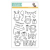
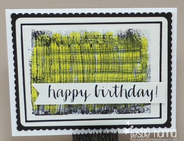
And yes, I made a card:


I felt it could be simple. I also felt a burning need to print out a photograph, fussy-cut it, and put it on a card.

About the color and amount of scotch in the glass. First, I had to create a smaller glass (had to), since the only glass I had was too tall. Here's how I over-stamped it and made the smaller glass:


and I just cut out the smaller part of it. As for color and amount of scotch, when I was in Scotland, I had the pleasure of touring a small, still-family-owned distillery, and after the tour, we each got a dram of scotch in a glass. There were also pitchers of water on the table. The woman in charge said, "Please do not insult us and fill your glass with water." Who were we to argue?!?! So what if it was 9:30 am and we were drinking straight single-malt scotch, right? We didn't insult her!

So tonight I plan to have a small toast to my Dad, and remember all the fun things we did and great moments we had. Thanks Dad, and Happy Birthday! *cheers*

Stuff I used: Kelly Purkey/SSS Happy Birthday stamp set, and the following:


Tuesday, April 28, 2015

CSSC #3 WINNERS

[Looking for today's SOS post? Please scroll down, or click here.]

THANK YOU to all who played my third sketch challenge! I continue to be humbled by your support. xoxo

Here are my top picks for April. The winner is Maura, with this card:


There's something about those colors that pulled me in.

And the two runners-up are Kathy:


I liked the pretty combination of papers (even if they are gah pink), and the fact that she used a cool coin, which I may also have hoarded.

and Lauren:


who has the insane ability to put 10 pounds of stuff on a card and make it all look like it's meant to be there. I bow down to her daily.

Congratulations, ladies! Feel free to grab your badge from the CSSC Rules & Badges page, and display it proudly on your blog. You've earned it!

And Maura, please email me (link on the right) to select your ink colors!

I'll be back on the first with a new sketch!

Thanks, again, for your support! xo

SOS #199: Opposite Day

It's Tuesday, and time for a new challenge at Shopping Our Stash. This week's theme is Opposite Day, and we'd like you to break out of your comfort zone and do something that's opposite your normal style. Do you tend toward more of a CAS style? Why not add a frou-frou ribbon? Normally more of a pile-it-on type? Then try CAS.

In my world, I've found I'm more CAS these days, so I forced myself to play with some mixed media supplies in my collection. Here's my card, then I'll explain:


It still smells CAS, but I really did try. First I applied a layer of white Gesso to some SU water color card stock (I have no idea why I chose water color ... it was on top), then I scratched a pattern into the Gesso with my Tim Holtz scratcher thingie:


And yes, I made two, since I mess up a lot, and it makes sense to cover myself in these perilous times.

Once it dried, I broke open my black Gesso, painted it on in the opposite direction, then scratched it with the scratcher thingie, too:


Then I waited for things to dry. I might have napped.

The next day I decided the black & white needed a shot of color, so I added some Hero Arts Neon Ink with my dauber bottle.

Next up I decided it still looked amazingly CAS, so I needed to add layers. I broke out my maybe-used-once Simon Says Stamp Frames set and got to cutting. Many layers of frames ensued. I used to layer everything, but now, not so much.

I added a busy-ish sentiment that I used my MISTI to stamp multiple times to get a clean image.

Okay, it still squeaks out some CAS, but I really did try, and I played with some mixed medaia stuff that's usually ignored in my stash, so I call it a success.

Why do I now feel the need to go back and add some black paint drops to the card front? STOP. Just STOP!

So, want to stretch your wings a little? Come on over and play our Opposite Day challenge!

Thanks for stopping by!

Stuff I used: SU Basic Black card stock, SU water color paper. and the following:


Wednesday, April 22, 2015

Organization Fall-out

Funny thing when you organize ... it actually creates work. I mean, I had this box of ignored and unloved stamps because they were all tiny and out-of-the-way and I just never looked at them much. Once I put them all into larger and similar-sized envelopes, I got to touch and feel them, and remember them fondly.

As part of the next step: to put them away with their other more-loved brethren and sistren, I kept out a few to use. I KNOW, right?!?!

Here's one sentiment set that got used:


heh heh I had to pair the sentiment with my Stampers Anonymous ladies ... just had to. The papers were all pieces from my Fancy Pants True Friends 6x6 paper pack.

Here's another stamp that got used before it was filed:


It's an adorable bunny butt from Verve, and it screamed for a wobble, so who was I to argue? For the contrasting circle, I used a piece of green card stock that was sitting on my desk, selected a pale grey background piece of paper, stamped the bunny in Memento London Fog, and colored it with a Copic. I also opened and used a bunny tail fluff thing. Go, me. The thing really does wobble. :)

Now those two sets have been filed, and I'll hopefully see and use them more now. A girl can dream.

Thanks for stopping by!


Tuesday, April 21, 2015

SOS #197: Texture Me

It's Tuesday, and time for a new challenge at Shopping Our Stash. This week's theme is Texture Me, and we'd like  you to use your oldest embossing supply: folder, powder, or go another step back in time and use a texture plate, or even a brass stencil!

Here's my card, then I'll explain:

Yes, I DID look for a comma on my Dymo labeler, but it eluded me.

I think the last time we did this challenge I also used a Fiskars texture plate. Those things are ancient, and during my recent "put it away where you have a ghost's chance of finding it again" policy with my craft room, I even have the funky tool that came with the plates. This was way before embossing folders.

I have a print-out of Cuttlebug instructions for using the plumber's rubber gaskets I use with these plates, but I no longer have a Cuttlebug, so I faked it with my Big Shot. I used (from bottom to top) the Big Shot base, cutting plate, Fiskars texture plate, card stock, and thin rubber gasket. It embossed just fine, so I was happy.

For the rest of my card, I decided to play a few challenges. I combined the current ColourQ challenge:


and the current The Male Room challenge:


I pulled out my Riley guy, since I almost never use him, and my trusty Dymo labeler for the custom sentiment. I've found that the labels come un-stuck after a while, so these are popped up (hopped up) with pieces of foam tape.

The numbers are my splash of color, and they were cut from a piece of red card stock laying next to my trimmer.

Here's a closer look at that texture plate impression:


So, got old, unloved, embossing products in your stash? I think you should play along with us this week over at SOS!

Thanks for stopping by!

Stuff I used: SU Basic Black and Basic Grey card stock, rubber gasket from the hardware store, Jack from Riley & Company, and the following: