
I took a major departure from my recent CAS cards, and I made this:

So. much. purple. And it's dangerously close to (gah) pink! I followed this Deconstructed Sketch:

I was hugely influenced by some pretty ribbon gifted to me by sweet Miss Lauren, and these papers went with that color green. Sometimes we must make sacrifices for our craft.
I chose the busy paper for the background, and cut a piece of the green for the horizontal strip. The shaped paper at the top of the strip is a punch-out from the paper pack, and I cut a thin strip of another purple for the bottom of the green strip.
The green ribbon is on elastic, and that gives it a mind of its own, so I forced it into submission with some Be Creative (Sookwang) permanent tape. It's still a bit off.
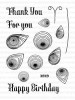
For the small banner and the back of the oval, I cut from the same purple paper I used for the thin strip, and I cut the large banner and small ovals from white. The sentiment was stamped in Hero Arts Charcoal, and the pretty heart was in a pile of hearts sitting on my desk.
Before I added the banner to the card front, I decided to add another piece of the floofy ribbon to line up with the other ribbon, mostly because I could. The banner was attached to the card front with foam tape, the better to span over that floofy ribbon.
I've used a total of four different patterns of paper. If you have 6x6 paper packs laying around, this is a great way to get matchy-matchy papers you can easily use together. So come on over to SOS and play along!
Thanks for stopping by!
Stuff I used: Crate Paper Trims: Peppermint, Kaiser Craft True Romance 6x6 paper pad, and the following:


oh my gosh, i didn't even recognize that ribbon until you mentioned it... even though it was the first thing i noticed, b/c OF COURSE the floofy texture is FAB*U*LOUS!!! love love love the patterny goodness of this, it's luscious without being overwhelming! & yeah, you're right, it'd be EVEN BETTER in pink, lol!!! :)
ReplyDeleteLove your paper choices, Leslie, and the sketch is perfect for showcasing each one! Beautiful color integration and just the right amount of texture and depth! Great work!
ReplyDeleteHugz,
Chana
Beautiful papers, and perfect sketch, fab job.
ReplyDeleteMmmmmm lovely purples! So soft and pretty! Fab take on the sketch as well!
ReplyDeleteThis is definitely far from your pretty CAS cards, but look at you, conquering all those layers! This card looks amazing!
ReplyDeleteWow, am I at the right blog? That's so close to pink I'm sure I'm in the wrong place.... and so frilly! I like it though. I like the mixing and matching of the papers. It all works well. Great job!
ReplyDeleteSo sweet. It's very Victorian feeling with that lacey goodness.
ReplyDeleteermagerd, Leslie, are you feeling ok? Purple? And a pinky purple at that! lol This turned out beautifully although you were obviously channeling someone else :P
ReplyDelete