
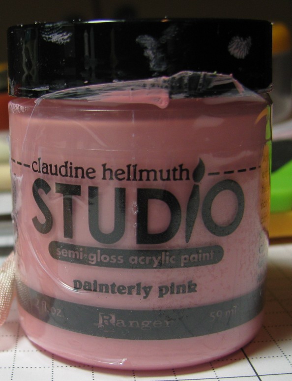
I started with my Claudine Hellmuth (gah) pink paint:
 I put some into a spray bottle with some water to make a wash:
 (Yes, I got that at The Container Store for 99 cents. Travel section.)
Then I went to Mel McCarthy's blog and tried to duplicate this pressure emboss resist technique of hers. Here's my first attempt:
 I first dry-embossed a piece of Whisper White card stock with SU's Vintage Wallpaper embossing folder, then I inked up the raised portion with Versamark and heat-embossed it (twice) with clear EP. THEN, I poured a little of the paint wash into a jar lid and used a foam applicator to paint over the embossed paper. The heat-embossed portion resisted the paint and it was absorbed only by the un-embossed portion of the paper. It's subtle, and I like it!
I added the pink card stock to accentuate the pink paint wash, and for contrast I added the black satin ribbon and some black Stickles.
Then I tried a piece of patterned paper:
 I really like this one! I dyed that seam binding myself with Pink Pirouette ink and a little water, just like Mary Dawn taught us. :)
Next, I used that paint wash as a spray with a stencil in an attempt to be artsy. Instead, I made a mess, but I also made this:
 You might have to click on the photo to actually see the pink, but it's there. I put a TCW template (TCW = The Crafter's Workshop, and the template I used is mini damask) over some water color paper and spritzed the paint wash over it. I removed the template and let it dry. It wasn't awful - a little runny so the pattern isn't very distinct, but I've embraced its subtle-ness and learned to love it. It actually is a pretty nice not-plain background.
I decided it said "sympathy" so that's the Paper Smooches sentiment I used.
Oh, those specs? One was an "OMG WHAT IS THAT" and the rest were on purpose, to make it look like I meant to do that. ;/
For my last sample, I played with these two colors of paint:
 to make this:
 The last farm in the 'hood has been sold for development, so I went for a walk a few weeks ago and took some photos. Here's the one that inspired this card:
 Okay, back to the paint. I put a bit of each of the green and blue onto my non-stick mat, spritzed them with water, and used pieces of Cut-N-Dry foam as applicators to schmear the paint onto a piece of water color paper. I like the swirls of my applicator - they make the sky and grass look a little wild, which is what I was going for.
After the paint dried, I went back to stamp the tree (A Muse) and drew in a few birds. The fence is a MS punch, and I cut off the pointy tops to make it look more farm-like - like this:

So yeah, inspiration is EVERYwhere. Now go break out your paints and come play today's HYCCT challenge!
Thanks for stopping by!
Love those! I never think of using paint to make a spray, what a great idea. I really like the last card. The swirls in the sky and grass are wonderful.
ReplyDeleteWow, your art is awesome! Love your cards and creativity. So sad to see those gorgeous farms sold to development for the soon-to-be 7 gazillion people on this planet.
ReplyDeleteLove the idea to use paints, thanks for the inspiration
ReplyDeleteMUST!
ReplyDeleteGET!
PAINTS!
OUT!
NOW!!!!!!!!!!!!!!!!!!
♥♥♥♥♥
(no time for further comment sorry paints are urgently CALLIN' ME!!!!!!)
xoxoxolb
So THAT'S what I'm supposed to do with the couple dozen paint pots I have. LOVE the white embossed with pink tinted background card and especially how you stitched the pink strip to the card under the black ribbon. The patterned paper card is simply divine (gotta love the black & white & pink color combo - classic and classy). The sympathy card has a little sass to match that sentiment font, the background turned out fabulously subtle. And you totally ROCKED the blue & green swirlie painted card, even to the littlest detail such as the farm fence adaption to the MS border punch. Wow.
ReplyDeleteso pretty - i especially love the farm card & the pictures it was inspired by!
ReplyDelete