Hello! Back in September I won a challenge at Stamplorations, and that included a guest DT spot. (squee!) Today is that day, so here we go!
Here is today's sketch:
and my card:
I used two digital files here: the 1" Squares Digital Collage Sheet and the Printable Faded Butterflies Journaling Cards Digital Collage Sheet. First I cut out a square of four images from the birds sheet, then I cut out the grey journaling card and mounted the bird square inside the frame of the journaling card.
The layer under the journaling card is one of my water color experiment cast-offs, and I thought the orange and yellow worked well with the birds. I mounted that onto a layer of grey card stock, then put the whole thing onto a white card base.
For the sentiment, I stamped one of the sayings from the Taylored Expressions Shade Tree Sentiments set onto a piece of Distress water color paper, then trimmed away some of the white. I like to do that around words that are only tall in a few spots because of a few long or tall letters. I think it makes the sentiment panel less bulky.
Thanks again to Stamplorations for the opportunity for the Guest DT spot. I'm so honored!
Thanks for stopping by!
Showing posts with label OMGIWON. Show all posts
Monday, October 20, 2014
Saturday, August 16, 2014
Using Some New Stuff
Yesterday I decided to play with some of the yet-to-be-used stuff that's languishing in The Abyss (that area at the foot of my desk, and the surrounding floor, that collects all the stuff I haven't used so I can't put it away). It's getting tougher to move in there, so it had to be done.
First, I grabbed my Art Impressions Girlfriends stamp set and I made this:
By now you know I don't like to color, so I thought I'd paper piece the ladies' clothing. This turned into a WHAT WAS I THINKING?!?!? moment, or should I say several hours. Not that it would have taken me less time to color them, but at least with paper piecing I can cover up mistakes or change my mind.
See those hands? Yeah, problems. I ended up piecing the clothing with the hands intact, then stamping, coloring and fussy-cutting the hands separately. It was actually easier, and the hands have some dimension now. Also, the shirts don't fit perfectly into the space above the slacks, so I called it "their camisoles are showing". They be stylin'.
Two rare tools used here: A Wink of Luna silver brush marker for the earrings, and an ultra-fine-point Sharpie to color their upper lips a very bright red.
The sentiment proved to be a problem. Since I'm generally opposed to making other than an A2-size card, it just didn't fit anywhere to my liking. I was going to put it under their feet, but it didn't feel right. There 's another more-square sentiment in the set, but I really wanted to use this one, so I stamped it on vellum with Memento Luxe black ink and clear-embossed it. This way you can still see the image and handsome paper piecing.
The colors of their clothing were chosen based on the current (current, I know!) Nacho Average Challenge colors:
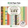
I used paper from the Echo Park Simple Life 6x6 pad for the green and orange-red, and Basic Grey PB&J for the navy.
ETA: Wheee! I won Top Nacho with this card!
For my second card, I followed the now-expired City Crafter Challenge to use a house on a project. I immediately thought of my cache of wood veneer houses, and I made this:
Just because a challenge is expired doesn't mean I can't use it; it's still a good challenge, especially if it gives me an idea to use up some stash!
I used the colors from the now-expired Color Throwdown challenge:
I used Hero Arts Tide Pool ink for the Bermuda Bay, Copic R08 for the Real Red, and Copic N2 for the Smoky Slate. I like the color combination, a lot! I colored the houses with the Copics, and used the Tide Pool ink to sponge in the sky and grass. So what if I have a green sky?! It's ART! (Thank you, Lydia, for helping me to justify my color choices.)
I put the white panel onto a piece of Hero Arts Mixed Pool layering papers, and attached it off-center to a white card base. The sentiment from Clearly Besotted was stamped in Hero Arts Charcoal.
I kinda like how this one came out. :)
I'm headed back in to work on some more challenges. I'll be back to share if anything turns out to be blog-worthy.
Thanks for stopping by!
Stuff I used:
For the Girlfriends card: Basic Grey PB&J 6x6 paper pack, red ultra-fine-tip Sharpie, I listed the ZIG 2-way glue pen, but I used my SU 2-way glue pen since it was closer and works just as well -- I have both), and the following:
For the Houses card: Wood veneer houses from my stash, A*Muse Studio cloud dies, and the following:
First, I grabbed my Art Impressions Girlfriends stamp set and I made this:
See those hands? Yeah, problems. I ended up piecing the clothing with the hands intact, then stamping, coloring and fussy-cutting the hands separately. It was actually easier, and the hands have some dimension now. Also, the shirts don't fit perfectly into the space above the slacks, so I called it "their camisoles are showing". They be stylin'.
Two rare tools used here: A Wink of Luna silver brush marker for the earrings, and an ultra-fine-point Sharpie to color their upper lips a very bright red.
The sentiment proved to be a problem. Since I'm generally opposed to making other than an A2-size card, it just didn't fit anywhere to my liking. I was going to put it under their feet, but it didn't feel right. There 's another more-square sentiment in the set, but I really wanted to use this one, so I stamped it on vellum with Memento Luxe black ink and clear-embossed it. This way you can still see the image and handsome paper piecing.
The colors of their clothing were chosen based on the current (current, I know!) Nacho Average Challenge colors:
I used paper from the Echo Park Simple Life 6x6 pad for the green and orange-red, and Basic Grey PB&J for the navy.
ETA: Wheee! I won Top Nacho with this card!
For my second card, I followed the now-expired City Crafter Challenge to use a house on a project. I immediately thought of my cache of wood veneer houses, and I made this:
Just because a challenge is expired doesn't mean I can't use it; it's still a good challenge, especially if it gives me an idea to use up some stash!
I used the colors from the now-expired Color Throwdown challenge:
I used Hero Arts Tide Pool ink for the Bermuda Bay, Copic R08 for the Real Red, and Copic N2 for the Smoky Slate. I like the color combination, a lot! I colored the houses with the Copics, and used the Tide Pool ink to sponge in the sky and grass. So what if I have a green sky?! It's ART! (Thank you, Lydia, for helping me to justify my color choices.)
I put the white panel onto a piece of Hero Arts Mixed Pool layering papers, and attached it off-center to a white card base. The sentiment from Clearly Besotted was stamped in Hero Arts Charcoal.
I kinda like how this one came out. :)
I'm headed back in to work on some more challenges. I'll be back to share if anything turns out to be blog-worthy.
Thanks for stopping by!
Stuff I used:
For the Girlfriends card: Basic Grey PB&J 6x6 paper pack, red ultra-fine-tip Sharpie, I listed the ZIG 2-way glue pen, but I used my SU 2-way glue pen since it was closer and works just as well -- I have both), and the following:
For the Houses card: Wood veneer houses from my stash, A*Muse Studio cloud dies, and the following:
Subscribe to:
Posts (Atom)