Sunday, February 3, 2008

A Little Stampin' Penance

Call it what you will, and maybe 'penance' is not the correct word, here, but what I did was make myself use something I already had before I broke into my new stuff.

Some time last year I 'discovered' Parchment FX stamps. As soon as I typed that I recalled that writer David Sedaris said he would never date anyone who 'discovered' a restaurant currently listed in the phone book. So I guess I 'stumbled upon' these stamps when I saw this card in the SCS gallery. The poster hooked me up with the company in the UK (it is her LSS), and I caved and bought all the sets. I made one or two cards, then set the stamps aside, mostly to gather dust. I took them out today to USE them - a novel concept, I know.

The Parchment FX stamps allow you to stamp an image that looks like Pergamano, but without all the work. You can also go back over them with the punching tools, but that is not why I purchased them. I am LAZY! I wanted the look without the work. :-)

I have already used some of the fan parts to make this card and this card, so I decided to cut out the butterfly sets and use them today. This is the first butterfly card:

Recipe: Stamps - Parchment FX, Warmest Regards; Paper - Whisper White, Vellum Cardstock, Pallet-O-Prints So Saffron; Ink - Versamark, Basic Gray; Other - Winter White Detail EP, Ribbon Originals Sherbet.

The butterfly is made up of three parts (layers). I stamped the three images with Versamark on Vellum Cardstock; I think the paper vellum is too thin for this. The Parchment paper used for Pergamano is more like SU's cardstock-weight vellum, and I like it better. I white-embossed the images and cut them out, then stuck them together in the middle with tiny pieces of red-line tape. The wings are not stuck down at all, and that gives it a lot of dimension.

I have to say, cutting these out is very easy, and you get an amazing look with the little time you've invested. I wanted the butterfly to stand out, so I chose a soft color of DS paper, and as I walked past my stash of SU ribbon (see what happens when you don't put everything away? It is right there in front of you for inspiration!!) I grabbed the wide So Saffron ribbon to go with the So Saffron DS paper. I can never figure out what to do with the wide ribbons, anyway, so there ya go! :-)

I chose the Basic Gray ink for the sentiment so it showed up, but was still softer than black would have been.

The first card used the basic butterfly images. This next one uses the more kicked-up butterfly images, and I think I like it better:

Recipe: Same as above!
Now that I have made these, I have satisfied my 'must use it' requirement so I can now play with my new stuff! Yay! Off to play!

Saturday, February 2, 2008

Mini Criss-Cross Card

I have seen a lot of Criss-Cross cards lately (instructions can be found here). I have made these in the past, and I while I do like the look, I have found them to be quite hefty. I had this idea to lighten it up a bit, and here is how I did it. First, the card:

Recipe: Stamps - So Many Scallops, Celebrate Everything; Paper - Pumpkin Pie, Whisper White, Brilliant Blue, Jersey Shore DS paper; Ink - Brilliant Blue, Pumpkin Pie; Other - Pumpkin Pie, Old Olive, Bashful Blue and Brilliant Blue markers, Pumpkin Pie gg ribbon, Round Tab punch, 1/4" circle punch, and Scallop punch.

The standard pattern for this card is two pieces of 4 1/4 x 11 cardstock. Score at 5 1/2 and overlap two of the sections to create the base (back) of the card. The remaining two sides are cut diagonally in half, two pieces of DS paper are added to the front, and the ends are crossed over the front of the card to make the pocket.

Here is what I did differently: I cut one piece of cardstock 4 1/4 x 11, and a piece of DS paper 4 1/4 x 11. I scored and folded everything the same way, placing the DS paper over the cardstock to create a pretty 'inside' to the card. The DS paper significantly lightened up the whole project, and I was pretty happy about that. I cut a piece of the same DS paper in a triangle to fit inside the cardstock flap on the front of the card. It does not 'match' the other side, but I really like how it turned out.

For the belly-band, I wrapped a strip of Brilliant Blue cardstock around the card and stuck the ends down with some snail. I wrapped and anchored the gg ribbon the same way, then covered the space with the scallop-punched piece.

I cut a smaller piece of Whisper White for the inside and put a blue tab on it to make it easier to pull out. The 'scallop' is a series of 1/4" circles stuck under the tab. I sponged the edges of the white with Pumpkin Pie.

This design has a lot of potential, and I wanted to use it as one of my workshop projects for next weekend. Trouble is, I rarely buy more than one pack of the DS paper unless I know in advance I will need it. Based on my lack of planning, I finally came up with the project when there is only a week left before my workshop, so getting enough of the Jersey Shore paper to go around is not an option. What to do, what to do... Enter my one downline in a phone call. We chatted about just about everything but World Peace, and somewhere along the way she suggested a mini criss-cross card - same concept, just smaller so that there is enough paper for everyone. Bingo!!! I played around and ended up with this:


Recipe: Stamps - It's Your Birthday, Celebrate Everything, Pick A Petal; Paper - Pumpkin Pie, Brilliant Blue, Whisper White, Jersey Shore DS paper; Ink - Pumpkin Pie, Brilliant Blue; Other - Pumpkin Pie gg ribbon, Accents & Elements Flower Fusion, Rhinestone brad, Linen thread, Slot punch.

I reeeeeally like how this came out! :-) The card is 4 1/4 x 11, folded in half, so it stands like a tent - opens at the bottom. The mini criss-cross pocket is made with two pieces of Jersey DS paper the same size, scored in half, and two of them overlapped to form the back of the pocket. I even got to use my new Felt Flowers to cover the spot where the paper and ribbon meet on the front of the pocket. I used the Slot punch to make two holes for the orange ribbon, but I think I'll have my customers use the Horizontal Slot punch instead. It will be a much cleaner look. ;-)

Well, off to make up some more workshop projects.

Thursday, January 31, 2008

A Doh! Moment

Today started off pretty well, at least better than yesterday did when I overslept and started out my day an hour behind. (I hate when that happens!) So today I left the house with my Son's birthday card, all written, sealed and ready for mailing. I also had two packages to mail (thank you for buying my stuff!!!), so I stopped at the PO on the way home.

That was when I had the DOH moment. I was so proud of myself for getting the card out and thinking how it might not even embarrass him when he opened it, when right after I slipped it into the ole slot, I realized I'd forgotten to include the little something I always send with my b'day cards. Can you say, "DOH!" So all the way home I had the Mom Recovery Card in the works within my brain.

I checked the mail on the way into the house, most anxious to get the card out of my brain and into reality, and look what I found in the mailbox:


My first thought was, "Wha?!?! A milk carton?!" until I checked and saw it was from Creative Mode, LLC. Remembering I had just purchased some stamps from there, I was soooo excited. Yes, about the stamps, mostly because they are all irreverant, but I was so impressed with the unique shipping container, I had to share!

Okay, done sharing. The idea I had for the Mom Recovery Card was to re-create my initial reaction in ... a card! The cool thing about making your own cards is you can make them say anything you want them to. AND, the creation became a Stash Dive card, to boot, because I used some of the must-have Target Dollar Spot chipboard letters I have never opened. This is what came out:

Recipe: Stamps - Pick A Petal; Paper - Certainly Celery, Real Red, Bashful Blue, Celery DS paper, Whisper White; Ink - Real Red; Other - Bashful Blue gg ribbon, Basic Gray marker, Jumbo Eyelet, Crop-O-Dile, Mini Glue Dots, Target Dollar Spot chipboard letters.

I think this says it all. :-) I started with the letters, and that drove the color choices for the card stock. There was no exclamation point in the chipboard stack (hey - they were a buck!) so I made one using one of the petals from Pick A Petal. I originally had used the Pick A Petal circle for the dot, but changed my mind at the last minute and kicked it up with the Jumbo Eyelet. The blue ribbon on the 'd' covers a scratch in the chipboard, and it really does match the blue stripe in the 'h'. I added the blue layer to make the whole thing look less Christmas-like, then went a little over-board and put ribbon through the eyelet, too.

What can I say? Not my best work (yes, it is a little crooked), but I love it, and it only took about 10 minutes to execute. Gotta appreciate that! Not a bad Mom Recovery, if I do say so myself. :-)

Monday, January 28, 2008

Atmospheric Phenomena and Hotel Inspiration

I did a mini Road Trip to the Midwest this past weekend, and I found myself surrounded by inspiring images. But first, let's discuss the Atmospheric Phenomena part of this post.

When I drive from Maryland to Michigan, I am going West. I leave in the morning, and since the sun rises in the East, it is usually behind me and not an issue until after lunch. Interstate 70 goes in a generally WNW direction between Maryland and Pennsylvania, so why, at 10:00 am, was the sun to my LEFT!?! Whazzup with that?!?!?! I had to put my sun visor to my left at 10:00 am! Lessee ... driving West, so to my Left is South, or if I am going more NW, then to my left is SW. Not East! The only thing I could think of was it had something to do with the tilt of the Earth at this time of year, so maybe the sun is not in the East East in the morning any more. Maybe? Anyone out there that knows the answer to this, please let me know!

So anyway, somewhere on the Ohio Turnpike I had to pull over and take this picture:


Okay, so I will not be nominated for any photographic awards for this shot, but I was trying to take the photo out of the driver-side window, in between the whoosh zoom of many, many, many semi's. I would have gotten out of the car like I usually do on my road trips, but not this time. The whoosh zoom's were too close together to safely open the car door and still expect it to be attached to the car for the remainder of my trip. But let me tell you about the sky. The clouds were a swirl, and on the left, where it looks sorta orange in the picture, the colors were really vibrant reds and oranges - it was gorgeous! You will just have to trust me on that one. :-)

Moving on to the Hotel Inspiration part of the post. After I checked in to the hotel (a Hampton Inn, in case you were wondering) I found myself needing to take pictures of things ... like the carpet in the halls and the wallpaper in the room.

This is a shot of the paper in the bathroom:

and this is the card that came out:

Recipe: Stamps - Weathered bg, Baroque Motifs, Fancy Flexible Phrases; Paper - Sage Shadow, Very Vanilla, Creamy Caramel; Ink - Creamy Caramel, Sage Shadow, Sage Shadow Craft; Other - Sage Shadow marker, Twill, SAMJ.

When I first saw the wallpaper, I thought about the now-retired On Safari background stamp, which I do not own, and a medalion stamp from the Baroque Motifs set, or one very much like it. I ended up using the Weathered background image with the medalion ... from Baroque Motifs! It is kinda difficult to see, but I scored the Vanilla card stock to give me a grid for placing the medalion with the Stamp-A-Ma-Jig. It worked great. Well, remember, I am the Crooked Stamper, so for me it helped a little. For other people it would be great.

Moving on, this is shot of the carpet in the hallway:

and this, well ... this is an example of what can happen when I have too much time on my hands:

Recipe: Stamps - Tres Chic bg; Paper - Certainly Celery, So Saffron, Always Artichoke, Not Quite Navy: Ink - Always Artichoke; Other - Versamarker, Cutter Kit (for the curved pieces), Corner Rounder punch, clear EP, Vanilla gg ribbon, misc eyelets.

The eyelets on the smaller piece of Artichoke looked okay - just for some character, but then I got a little carried away and put some eyelets on the right-hand panel, then got a hair-brained idea that I could kind of lace them together. Uh-uh. Then I searched and searched for a sentiment that would work, and I finally opted for the 'Believe' word on the Tres Chic stamp since I'd already used it as the background. Coincidentally, that part of the background stamp is the whole reason I bought it in the first place, but I had no idea inking it up would be such a challenge. I ended up using the Versamarker to ink up only the part I wanted, and, well, it finally came out passable, but this is not one I'd try to mass-produce.

Ya know, the more I look at this card, the more I dislike it ('hate' is such a strong word.) There's too much going on, and I guess I just lost focus. I had good intentions, but in the end I failed in the delivery. Please feel free to link to this card as an example of what not to do with carpet inspiration. I think I will try again, maybe using just the colors, as that part of this attempt seems to be okay.
Oh, well. Off to try again.

Quick Birthday Card

Having two sons in the "Young Adult" age group provides me with an ongoing challenge to make cards that will not embarass the bajeebers out of them in case their roommates might see them. So for my youngest's 20th birthday I made this card today:

Recipe: Stamps - All Year Cheer 2; Paper - Soft Sky, Old Olive, Kraft (or maybe the old Confetti Tan), Whisper White, Fall Flowers DS paper; Ink - Old Olive Craft; Other - Oval eyelets, Clear EP, Rub-ons, Olive gg ribbon.

The layout for this card was totally inspired by last week's Mojo Monday sketch. The colors were taken from the piece of Fall Flowers DS paper I had laying around. See what happens when I do not clean up? Inspiration!!!!!

The dots and the message on the ribbon are some of the new SU rub-ons. Some of the dots did not stick, but it still works, I think. The stars are also SU rub-ons - three of them, in fact! I stuck them on some Soft Sky scraps, then cut them out and layered them. The whole thing really came together very quickly.

For my next trick, I plan to show you some of the Road Trip inspiration I collected this past weekend and the resulting cards. They are still works-in-progress, so hopefully later this week I will be able to share.

Monday, January 21, 2008

Cold enough for you?

I just read this on GinaK's blog, and what a hoot! Sometimes (okay...MOST of the time) I laugh at people in DC when they say it is freezing cold outside and I am still in short sleeves. Having grown up in the Midwest, including 2 years in Chicago, I completely identified with this post:

http://blog.ginakdesigns.com/2008/01/19/11-below-zero.aspx

Here in DC it was in the teens yesterday, so yes, I finally put on my winter coat this morning! :-) Now back to work!

Sunday, January 20, 2008

Busy, Busy Day

Today was my Free-For-All event. That's where people come over with their own projects in tow, and we spend all day creating. I offer up my scraps (organized by color, of course), my punches, my inks, etc. And I feed everyone with a kitchen full of munchies...healthy munchies today, except for the vat of Chex Mix, but it had cranberries in it, so it was not so bad.

Well, today should have been called a Freeze-For-All, because it was really cold out, for Maryland, at least. And there were gusting winds, too, so I think people opted to stay home and be toasty. But two brave souls did come over, and we played! Since they both brought everything they needed, I did not need to do too much running around, and *I* got to play, too! Whoo-hoo!

First up is a card I made with the stamp you have already seen (twice) from my GinaK set. Today I paired her with a sentiment I got last month but had not used yet.

Recipe: Stamps - GinaK, River City Rubber Works; Paper - Certainly Celery, Old Olive, Regal Rose, Misc white; Ink - Black, Old Olive, Going Gray, Regal Rose, Basic Gray, Blush Blossom; Other - SU Jumbo Eyelet, Misc ribbon, black marker, sponge dauber, blender pen.

This whole card started with the green ribbon - it has both celery and olive in it, so I wanted to use those two greens together somehow and tie it together (!) with the ribbon. I think it is funny that the ribbon kinda became too much with the lady in the car, so I ended up with just a little bit of it in the eyelet.

I cut the white card stock crooked - WAY crooked, but we collectively decided it looked neat that way, so I went with it. I kept layering with the crooked shape and I think it actually works for her! (Works for me, too!)

My favorite part of the card is her sunglasses. Rule #1 in stamping: There are no mistakes, only opportunities for embellishment. I went a bit wild with the Blush Blossom and ran over into her glasses, so she got to wear shades, and I LIKE them!

Next up is a card made with a stamp I got from a friend of mine who is also doing a stamp-room purge.


Recipe: Stamps - Grapes by Rubber Stampede; Paper - Water Color paper, Garden Green, Elegant Eggplant, Natural White; Ink - Elegant Eggplant; Other - Watercolor Wonder Crayons, watercolor brush, sponge dauber, Eggplan marker.

I am not the best water-colorer, so I dove right in to this challenge! I took the colors from the sticker on the front of the stamp and just played with the purples until I got the blending I wanted. I think it came out just fine!

I hand-wrote the sentiment because I could not get any tiny alphabet stamp set to line up with the correct spacing. Then when I went to erase the lines I'd used to get the words straight I schmeared the purple ink with the art eraser (!) so I took that queue to add the sponging to make it look like I meant to do that (Rule #2 in stamping: Learn how to say, "I meant to do that ...")

This next card is made with a stamp I got from another friend doing the stamp purge.

Recipe: Stamps - Lady by All Night Media, sentiment by River City Rubber Works, paw print by Technique Tuesday; Paper - Regal Rose, Going Gray, Basic Black Whisper White; Ink - Going Gray, Regal Rose, Pumpkin Pie, Creamy Caramel, Basic Black; Other - blender pen.

The lady just spoke to me, so I had to have her! I paired her with a sentiment I got a few months ago which seemed perfect! (Or is that purr-fect...:-)

Now THIS one was a challenge for me. Wide ribbon is always a tough one, but I was determined to make this work. The ribbon was from this month's shipment from my Really Reasonable Ribbon club - this month's theme is "violet" - LOTS of purple....

Recipe: Stamps - Noteworthy; Paper - Old Olive, misc textured white; Ink - Elegant Eggplant; Other - wide purple ribbon from Really Reasonable Ribbon, white rub-ons by SU, markers.

The ribbon looked awesome just laying on the white card stock, but it needed more - doesn't it always?! One of ladies suggested green, so I grabbed some Olive and it really set off the dark purple. Then I thunk and thunk and retrieved the Noteworthy stamp set from the back of one of my drawers. I loved this set when it was available (SAB, I think, a few years ago) and I am glad I held on to it! I used the Stamp-A-Ma-Jig to line up the flowers top and bottom, then stamped the sentiment in the middle. I colored the flowers with markers.

It still needed something, partly because the ribbon went on a bit unevenly, largely due to yours truly, but it is very wide, ya know ... I had originally thought about making a buckle with the ribbon, but all my Cuttlebug dies are very tiny in comparison to this Momma, so I decided to make it look like a buckle...kindof. I added a narrow strip of Old Olive card stock, then topped that off with a piece of the long strip of rub-ons from one of the new SU rub-ons. Done!

This next card was totally inspired by the ribbon. I made a trip to Recollections yesterday since it was in the same state as the LSS where I was retrieving some stamps I'd ordered. What a sad trip - I still cannot believe Recollections is closing. They were understandably pretty picked over, and people were buying the store fixtures while I was buying ribbon. I know, I know, I swore off ribbon because I joined that ribbon club, but it was 50-75% off!!!!!!!!! So anyway, right next to the register was a box of pre-cut yards of ribbon at 5-fer-something, and one of them was this red one with the So Saffron sentiment on it, so I had to get it. That's what inspired this card.

Recipe: Stamps - Heartfelt Thanks, Flannel Plaid bg; Paper - So Saffron, Basic Gray, Ruby Red, Naturals White; Ink - So Saffron, Basic Black; Other - Ruby Red and Garden Green markers, misc ribbon.

The ribbon actually matches the red paper in real life; I am just a bad photographer. This is a really fun ribbon because it has the sentiment right on it! I looked at this one for a while before I decided to add the flannel background. It's neat how much difference just a background stamp can make.

This last card was inspired by a piece of paper given to me by one of the ladies. She has had it in her stash for over a year so she was anxious to see what I could do with it. I thought about it all day and finally got to using it. I grabbed a spool of really pretty pink ribbon from my stash and it looked amazing with the paterned paper. Then I realized several of the SU stamps matched the flower in the paper, so I got them out and ended up using the Best Blossoms flower.
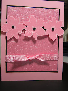
Recipe: Stamps - Best Blossoms; Paper - Pretty In Pink, Basic Black, misc pink paper; Ink - Versamark; Other - Mike's ribbon, Vintage brads, Dimensionals.

The more I looked at the ribbon the more I fell in love with it. It has a little sheen to it, just like the paper. I cannot believe I have had it so long and never even opened it yet!

The flowers are stamped with Versamark on Pretty In Pink card stock, then heat embossed with clear embossing powder and cut out. I popped them up on Dimensionals, and the middle one is double-popped (two Dimensionals).

The ribbon was actually added at the last minute. We were debating if it needed a sentiment or not, and if not, then the bottom half of the card seemed unfinished. Duuuuh - add the ribbon! And I am glad I did!

This is a close-up of the paper and ribbon - they are just sooo pretty!


So that was my day. One of the ladies finished her swap cards and the other one finished last year's Super Bowl scrapbook pages, just in time for this year's game. :-) A good time was had by all! And I have food left to last me all week!

Saturday, January 19, 2008

Coffee Mug Challenge

More creative avoidance going on here ... I found this cool challenge on JanTink's blog and I decided I had to try it! You are supposed to take your favorite coffee mug and be inspired by it, make a card, then post the card and coffee mug and link to it in a comment on her blog. THIS I can do!

In my house, no one drinks out of a mug. Or a glass. If you sit down on the couch with anything wet in an open-top container your beverage container will be head-butted by the cat. Ask me how I know ... Therefore, all my coffee is consumed in travel mugs because they have tops and are quite discouraging to the average head-butter. I suppose they are still technically 'mugs', so I set the mug-o'the-day on my mostly-cleared crafting area to be inspired, and this is what came out:

Recipe: Stamps - none!; Paper - Tempting Turquoise, Whisper White, Basic Black, misc vellum; Ink - Tempting Turquoise; Other - Slit punch, Cuttlebug, misc bling, sponge dauber, White taffeta ribbon, misc brads, SU rub-on.

This is soooo outside my comfort zone, which I suppose is one of the purposes of a challenge, right? It started with just the Turquoise card base with the black strips, then I discovered this really cool vellum in my stash. Here is a close-up of the vellum and the rub-on:

Isn't that vellum very cool!? And this is the first SU rub-on I've used, and I love the look! The bling is just individual pieces of rhinestones I tore off of one of those cell-phone bling sheets.

By the way, this card totally counts as a Stash Dive challenge - the vellum, the brads, the bling - totally!

Off to go clean up so I have room for the eight ladies who plan to arrive here tomorrow morning for my annual Free-For-All. We just play with our stamps all day, and I am really looking forward to it. :-)

Friday, January 18, 2008

A Duuuh Moment

Since I am once again exercising extreme Creative Avoidance, I allowed myself to check out the VSN going on this evening at SCS. I generally do not participate, but just a small peek was not going to be too bad, right?

The first challenge was to make a circle card honoring your girlfriends. Unfortunately for me, I did not remember that last part...all that registered in my pea-brain was the circle part. Luckily for me, all the stuff I played with last night was still out on my no-longer-clean stamp area so I made my second irreverent card using my new GinaK set.


Recipe: Stamps - GinaK Designs; Paper - Perfect Plum, More Mustard, Whisper White, misc purple patterned paper; Ink - Basic Black, More Mustard, Mellow Moss; Other - Key Tag punch, 1 1/4 and 1 3/8 Circle punches, misc brad, blender pen, sponge dauber.

Look familiar? It should! It is basically the same card I made last night, only I cut the base into a circle first. I should have spent more time on the inside half of the sentiment (I am not liking that too much right now) - maybe I'll add some mustard...nah, that will just make brown ... never mind.

So here I sat, chuckling to myself that I'd met the challenge in record time. I uploaded the pics and got ready to post, when ... aw, drat ... I'd completely forgotten the "girlfriend" part of the challenge! This would be the Duuuh Moment.

Not to waste a perfecly good image, I decided to show it off here instead. :-)

I think I am just not cut out for VSN. I am okay with the daily SCS challenges because they take me outside my box, but not so much the VSN. For example, Challenge #2 was to do something with Chocolate and Shoes, neither of which I am into, neither of which I appreciate, neither of which I spend time or money on, and neither of which I have stamps for. Lots of sentences ending in prepositions there, but you get my drift. Bah, Humbug.

Oh, and I was very bad today, and will be worse tomorrow. Today I went shopping at Creative Mode. The woman behind this site created the 'Ostrich' image once offered by GinaK, so since I had to have the little guy I went shopping. BTW, he is at the bottom of page 36. All the pages of the catalog are not up yet, but there was enough for me to get sucked in.

And tomorrow ...ah, tomorrow - a day filled with endless errands which now includes a trip to my LSS to pick up both of the stamps I had asked her to order for me. I can rarely get out of that store with only the items I went in for, so I fear a big-ticket day. Sigh ... wish me luck.

Thursday, January 17, 2008

I had to do it ...

First, a bit of business: I have made contact with Nicole and her package of Blog Candy goodies will go out to her tomorrow! Congrats, Nicole!

Back to the matter at hand...I had grandiose plans to be good this year. By 'good' I mean I was going to be much more selective about what I bought as far as stamping supplies, and I also planned to sell off all the retired SU stamps and accessories I had to have but rarely used (that part is going quite well, thank you!). With less buying and more selling, and add to that more new customers for the SU side of the house, so far so good. :-)

Yeah, yeah, I know, we are only three weeks into the new year, but overall I think I have done fairly well in the Not Buying part of this agreement. I have yet to hit the LSS to 'check out' the new stuff, I have only caved to tempation once and bought ribbon outside my regular monthly sampling from Really Reasonable Ribbon (I think I spent $10), and I have only spent, er...okay, but all the SU stuff I've bought was for Demo purposes, ya know? :-)

Aaaaand, I have been to the Papertrey Ink site two or three times this week and filled up my shopping cart and ... abandoned! (That's Web-speak for leaving the site without completing your transaction.) Abandoned!!! Me, with a full shopping cart! Whazzup with that!?!?!? Then I sold a few more SU sets and I felt better. Stay in the black ... stay in the black ....

However, when I saw this set at GinaK's, well, given my love for all things irreverent, what else could I do - I BOUGHT it! I cut the stamps last night and this evening I created this:


Recipe: Stamps - GinaK Designs; Paper - Pale Plum, Perfect Plum, More Mustard, Whisper White, Misc purple paper; Ink - Basic Black, Basic Gray, Going Gray, Blush Blossom; Other - Key Tag punch, misc big brad, misc gingham ribbon, dimensionals.

I have a rule that I almost never put anything on the inside of cards. I sell Note Cards, which means YOU have to write the note! So I tried and I tried, but I could not get all this to fit on the front of the card, so I gave in and stamped the second half of the sentiment on the inside. Then I went all out and added the Happy Birthday, too.

This is on Pale Plum, but ... just blame the photographer and the bad light...

I just LOVE this font! But I also love all the sentiments in general, so I can see me having a ton of fun with this set! I may have to start a line of cards with insides, but I'll have to think up a clever name for them. I have a few months to work on it. :-)

BTW, this card totally counts for my Stash Dive challenge with (1) the brad, (2) the patterned purple paper, and (3) the ribbon. Yay!

Gotta go finish the laundry I started this weekend ... oh, bother.