As I typed that title just now, I had a flash-back to early Thanksgiving dinners where we kids got to fight over who would split the wishbone. That was also a time when there were family members who liked the dark meat of the bird. Now that I am (supposedly) all grown up, if I cook on Thanksgiving, it's just a turkey breast, usually boneless. Even at gatherings with friends, where there might actually be even part of a bone-in bird, I can't remember anyone doing the wishbone thing.
Sadly, I just looked up the wishbone Thanksgiving tradition and the first hit was a sponsored ad for Wishbone salad dressing. Therein may lie all of the answers.
So, as I perused the challenges today, I saw Shari Carroll has a new color coordinates post up over at Simon Says Stamp:
and I got an idea.
I was just whining about how I don't like to follow the crowd and do red + black + white as a classic look, but I did the other day, anyway. It still bugs me.
So I made a card based on Shari's colors, but I mixed it up a little, too. :) Here's my first card:
I followed a now-expired but still lovely MFT sketch:
Since Shari's color coordinates were the greys plus a splash of color, I made my card all grey with just a small circle of red peeking out. I thought the card was boring, so I added some enamel dots on the bottom left, too. All better.
I also played the current Addicted to CAS challenge to use dots:
For this, I stamped a Hero Arts background onto the SSS Fog card stock using SSS Fog ink. It's subtle, but it's there:
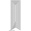
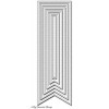
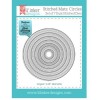
I suppose I could make a case that the enamel dots are also dots, as are the circles (very big dots) and the dotted-edge banners. I think I'm covered.
Never one to leave well-enough alone, as I cut things out I did each step three times, because I had three ideas. While Shari's splash of color was red this week, last week it was blues:
and since I'm in a blue rut these days, I made the same card as my first one, but replaced the red circle with a blue one:
Again, I thought it was boring, so I added enamel dots.
Then my third idea combined the first two:
Since I stamp without a net, adding the red circle to this one made the piece too large to fit on the right side of the banner, so I moved it to the left side. This also eliminated my feeling of "it needs something", so no enamel dots here.
Except for all that die-cutting, these three cards came together pretty quickly. That makes me happy. :)
Thanks for stopping by!


Very pretty. I love the blue accents.
ReplyDeleteGreat ccards Leslie! I like them all, but especially the last one! Hazel x
ReplyDeleteHope you had a nice holiday. Just returned from your neck of the woods sort of (further west/north in the state). Love all three cards, but love the last the most.
ReplyDeleteHi Leslie. Great CAS design and fabulous in all three of the colour combos. Thanks for joining us at ATCAS.
ReplyDeleteyou know, as much as i LOVE the sketch... the 3rd card with the circle on the left is my fave; so beautifully balanced! (on the other hand the enamel dots WORK missus!!!) i love that you get three ideas and make them as three different cards. i get three ideas and try to squish them all into one card and get a headache.) :0
ReplyDeleteThe one with the blue is the bestest of them all... not to knock the combo one or the one with the red.
ReplyDeleteThere's nothing better than a clean, simple design like this, and you've used these colors beautifully! I love the splashes of color, piercing and especially those enamel dots! Great cards!
ReplyDeletePS: My sister and I always pulled the wishbone too, and she cheated every year by putting thumb at the top! LOL
Here's a comment, un moderated, with an ezCAPTCHA.
ReplyDelete