Sunday, October 28, 2012

HYCCT1228 - CAS

Hi there! Today is my day to hostess the HYCCT challenge on Splitcoast. I chose Clean and Simple (CAS) with a sentiment as my challenge. CAS because it's been a long challenge month, and I thought CAS would be refreshing. Plus, I can't do it very well, so it's perfect for me. The twist I give you is the focal point needs to be a sentiment or word.

That said, here is my card:

It's very WHITE! I used three pieces of washi tape and put the sentiment over it. Done. You know, if I do about 23423956764 more cards like this one, I may make a dent in my washi stash. Sigh.

Why not stop by the HYCCT forum and play along?

Thanks for stopping by!


Saturday, October 27, 2012

Autumn Tree

This is another one of those "it seemed like a good idea at the time" projects. Here's my card, then I'll explain:

I was inspired by a tree I saw on the way home from work. The outer edges were golden yellow, the top was red and the inside leaves were still green. I immediately knew I needed to use this tree die, and it came out pretty much as I'd envisioned it in my head. However, the rest of the card didn't happen easily.

I know, you're probably thinking it's just some cut green scraps - how hard can it be? In my world, it's hard. Er, difficult. I was working with remnants, and I kept cutting the hills wrong. Then I went to emboss the sentiment and I used white instead of off-white, so I removed the top layer of green and went back to trying to add another hill that worked. Three days, people; we're talking three days for a stoopid hill. I got smart and used the Stamp-A-Ma-Jig to align the sentiment, and I used SU Winter White EP, which is still too white for this card, but I don't have any cream-colored EP. Does anyone even make it?

Hmmm, I just noticed all that big open in the upper right corner. I'm feeling a bit twitchy... it might need birds.

I just looked outside, and thought I'd show you the view out my back door:

See how that yellow tree is still green in the center? That red tree is mine, and it's not well. I have a tree guy coming out today to see if she can be saved. I do love the red.

I have a stack of challenges laid out to tackle this weekend. I'll be back if I actually get to any of them.

Thanks for stopping by!

PS: The Arboscello Tree Die is detailed enough you need the metal shim with it. It pops right out!

Products used but not linked below: Twinery twine, MS deer punch, SU Confetti Cream card stock (I think), SU Winter White EP, SU So Happy For You stamp set. Also, I included the Distress Seasonal collections below, but you can buy the inks individually now.


Thursday, October 25, 2012

Washi Friend

Our lovely coordinators over at OWH have asked for "Friend" cards. I can do that. I find if I have some direction, it's easier for me to make a card for a certain occasion. Sometimes, not always. But I took this opportunity to play with washi tape knowing I needed a Friend sentiment. Easy peasy.

Unless you're me, of course. Oh, the washi part was fine; it's the stamping part - specifically straight stamping - that stumped this chump. I made four beautiful card fronts last night, then stamped all four of them crooked. Okay, I was using a rubber stamp instead of a clear one, so I must just be spoiled. Yeah, so it's not my fault. Sigh.

Tonight I decided to make four more card fronts, but this time I'd employ the Stamp-A-Ma-Jig. It's amazing how that works, isn't it? ;/

Here is one of the four SAMJ'd cards:

Nice, huh? I love that color combination.

Now, about the first four card fronts... I needed to save them, so I went into SYFY (Save Yourself From Yourself) mode and decided I could cover up the sentiments with another panel. And I did:

I stamped the sentiment again on some of the same paper, then die-cut it using my Labels 4 Nestabilities. I edged the label with my black Memento marker, but it was still boring, so I die-cut some thick card stock (or thin chipboard, or part of a box, or whatever that stuff was) and put two pieces behind each white die-cut sentiment to give it some dimension:

I did not bother to go back and color the edges. I know I could have just put it up on dimensional adhesive and not bothered with the additional die-cut pieces, but that would have exposed my mis-stamp, so the cover-up was a better option here.

The other cool thing about this is I got to overlap the sentiment over the top piece of washi tape, and also have it stick out over the edge of the panel:

Oh, look, it's crooked. ;/

Since I saved the first four cards, I now have eight more cards for OWH. WIN!

Okay, I may or may not have received a few new items in the mail today, so I'm going to go play. :)

Thanks for stopping by!

Wednesday, October 24, 2012

HYCCT1224 - Kissy, Kissy

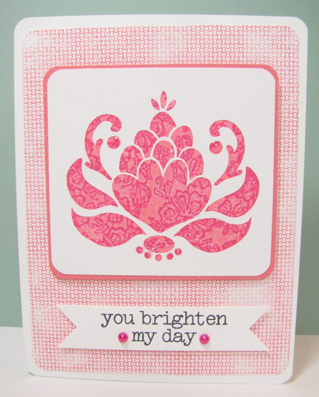
My pal Libby is hostessing today's HYCCT challenge over on Splitcoast. She has asked us to use the Kissing technique, and I knew exactly what I'd make. This:

Yes, I know, it's gah PINK. But I have to tell you that one of the colors is almost orange - it's Cameo Coral, and I know it probably doesn't go with Melon Mambo, but it does now. Here's how things went down:

1. Ink up a detailed line-y background stamp with the darker of the two colors (I used Hero Arts' Lace bg and Melon Mambo ink). Leave this face-up on your table.
2. Ink up a solid stamp with the lighter of the two colors (I used Ornate Blossom and Cameo Coral).
3. Huff a little on the background stamp to make sure it's nice and moist.
4. Stamp your solid stamp onto the background stamp, then immediately stamp it onto your card stock.

What happens is the darker color will transfer onto the solid stamp and leave the line-y pattern. See:

I've done this in pinks here, but I've done it before with ... thinking ... one of the colors was River Rock and it was mostly green. Maybe the other color was in the red family. I'll come back and edit this when I find my old post. ETA: It's here. It was Poppy Parade + River Rock. I also tried a few other color combinations. :)

Oh, and those shiny spots above are where I added Glossy Accents to the stamped image.

So, are you playing along with the HYCCT challenges? Hmmm? There's no time like the present to start. We'll be here all month, and you'll have until Nov 7th to mail your cards to the Cancer Center. 

Thanks for stopping by!

Tuesday, October 23, 2012

Neon Lines

One of the things we learned in the Kick Start Online Card Class was how to CASE a card but not. Instead of printing off the card, or bookmarking it for later, take a moment and think about what it is about the card that attracts you. Is it the color combination? A mix of patterns? A blend of techniques? Then take notes. I started to keep a little notebook with me, and when I see something I like about a card, I write that down. Then, when I need inspiration, I go to my notes and I have options. I can either take one of the ideas and use it to kick-start my mojo, or even combine a number of ideas all onto one card.

The beauty with this approach is you take a little extra time to think about the composition of the original card, and it keeps you from ever copying someone else's card, which is, well, wrong.

One of the things I had written down ... I saw a card where someone had taken a long thin striped stamp and made a plaid. The whole card front wasn't covered - just a few impressions, and where they crossed, the stripes made a plaid. So my idea was to take a patterned stamp and try the same thing. I did, and it came out kindof cool.

I used the notebook paper stamp from this Lawn Fawn Schoolhouse Backdrops set:

 (yeah, it's out of focus) and made this:

 I stamped it once in each direction in three different neon colors. I was pretty careful and they're almost straight, even:

I think I stamped the pink one first (so I could see it), then the orange. By the time I got to the yellow, I was muttering "below the pink and above the orange". Ha.

I looked at this for a few days before I figured out what to do about the sentiment. I ended up using some navy blue cloth letters from Prima.

So there you have it - I've actually used something I learned in class, and it's not even a CASE of a whole card; just an idea. I'll be using this again, because it totally works. :)

Thanks for stopping by!

PS: I colored my pearls with Copic markers, but not the neon Copics. I've found they dry dull and I like my pearls shiny. These were left over from another project, so I don't remember which markers I used. :(


SOS #74 - Out of the Jar

Happy Tuesday! It's time for another challenge at Shopping Our Stash. This week we ask you to use something out of a jar. There's lots of options: flower soft, glitter, perfect pearls, embossing powder, etc. Alternatively, you can use a jar image, or make something using a Jar! (decorate a jar)

See? So many options.

Being a rebel, I tried to avoid the obvious. I did not want to use embossing powder, but in the end, I did. I wandered around The Captain's Quarters muttering, "Jar , jar, jar ...". I have all my buttons in jars. I have a drawer full of embossing powder and flock. Spray mists and inks are in bottles, not jars, though that might be a technicality.

Then I spied a stack of three (only three) jars of scented embossing powder I'm pretty sure I've never used. I chose the green because I wanted to use the world stamp from one of my Hero Arts OWH sets, and this is what came out:

 This card could actually qualify as another entry in Coming Clean, since it uses so much new stash. I opened and used my Impression Obsession Gradient background, my Hero Arts OWH stamp set, and a roll of washi tape. And the new old EP.

Now it's YOUR turn. Go through your stash and find something that comes in a jar, then use it. OR, use the image of a jar OR decorate a jar. Then come back to Shopping Our Stash and link us up so we can see what you've made!

Thanks for stopping by!

Products used but not linked below: SU Baja Breeze card stock, Gelly Christmas Pine Scented EP.