Today's online class for A Cut Above was, coincidentally, the making of window cards using dies. Sooo, I decided to try again, and I could also enter the A Blog Named Hero challenge again! :)
Here's my card:
Do you like how I've held it closed with my ruler? Nothing but class here, folks.
The card base and stamps are A Muse Studio; patterned papers and ribbon by SU.
Here's the inside:
It all started with that doily. It was on the right side of my desk, so I decided to do a brown and blue card. The doily didn't work on the outside, so it went inside, and I worked with plain circles on the outside for the window.
I have a lot more practicing to do before I get the hang of these window cards. I think I struggle with them because I'm not used to doing the insides of cards. Once I get past that hurdle, things might get easier. This is a BIG step for me, people, B I G. Between this and white space, and all my Tim Holtz Distress stuff, I hope I don't get lost in the shuffle! OMG, my next card simply must be irreverent! GAH!
Thanks for stopping by!
Tuesday, April 17, 2012
SOS Challenge 48 - April Showers
This week's challenge at Shopping Our Stash is April Showers. But since we are SO NICE, and our object is to use stash, we've stre-e-e-e-tched the theme to include April Showers or SNOW (think: Christmas Card Challenges). Actually, anything weather/water related will work: umbrella, seahorses, scuba, fishes, seascapes, ponds, oceans, snowflakes, snowfall, snowmen, rainy days, raincoats, rubber boots, rain clouds, clouds, rainbows, ducks (yep, ducks!) Now you have NO EXCUSE not to play!
I went with the fish option, if only to make myself open and use my Hero Arts Oceans of Joy fish set. Here's my card, then I'll explain:
This was the fourth or fifth attempt, and I'm actually glad I kept trying. :) The fish and grass were heat-embossed with black EP, then colored with Gelatos:
Then I cut them out. I did. Here's the fish up close and personal:
I used three colors of Gelatos, then rubbed them with my finger to blend them.
For the grass, I used two colors of blue/green and also blended them:
The background of the card is a funky minty green color of card stock from my scrap box, and it's sprayed with my blue Ranger Distress Pearl mist. I love how it came out! There is a glob of pearl stuff under the fish, but well pretend it isn't p00p, k?
Also, I originally had that white twine wrapped around the card and under the fish, but he looked strung-up, and we can't have that, so I moved it over to the diagonal.
Yep, I'm pretty pleased with how this came out. :)
Okay, now it's YOUR turn. Go into your s-crap room and dig out something water-related (frozen water or the liquid type), make a card, then link us up over at Shopping Our Stash so we can see what you've made!
Thanks for stopping by!
Monday, April 16, 2012
Window Card
This week's challenge over at A Blog Named Hero is to make a window card. As I stood at my craft table tonight, I realized I don't remember making a window card before. But I started grabbing things off the right side of my table to use them up, and I got to work.
This is actually the second card I made. The first one was snarky and twisted and, well, I'll save it for last. :) So here's the second one:
I used my SU Framelits to cut the green frame, the vellum layer and the opening in the card front. Here's the inside:
I originally wanted the tree on top of the vellum, but vellum and I do not get along when it comes to adhesives, so I muttered a bit before I decided the tree could live on the inside. This also eliminated the pesky problem of having writing show through the window, because whoever uses this card (not me - I don't send cards, remember?) will not write on top of the tree, so that issue is no longer ... an issue.
When the card is closed, it looks like this:
Not bad, not bad at all.
Okay, ready for my first try?
Really?
Wanna see it?
.
.
.
Here she is:
A "window" card. Hey, it had to be done. It's crooked, and it's a mess, and it was too much work, and there's glue everywhere, so it won't make it off my desk, but I needed to share it. :)
Thanks for stopping by!
Sunday, April 15, 2012
More Cleaning
After my last post about cleaning by making cards with all my experiments and UFOs on my desk, I went back in for more. This time I actually triaged the stack o'stuff that lives on the right half of my desk and significantly reduced the pile. Yes, I am very proud. I will say that some of the experiments just got tossed, but two of them lived on to grow up and become cards! Let's have a look!
First, you may remember this pearlized piece from one of my earlier posts:
(Ooh, that came out a bit dark, sorry.) The sentiment was right next to the grey piece on the desk, and this card pretty much made itself from that point. I thought that weird blue-ish button would be nice with the black & white, and I added a piece of Bermuda Bay DSP under it to kindof ground the whole thing. I couldn't decide on which twine to use in the button, so I used both. :)
Next up I had a tag I used to pick up all the extra spray and ink from my craft mat. That's something we learned in our Creative Chemistry 101 class - never waste ink! Instead of having a plan, though, I used the same tag over and over to pick up whatever was on the mat.
Today, while cleaning the pile o'stuff, I re-discovered my "missing" Magenta butterfly stamp, so I used it! I stamped it in Archival black onto that tag, and this is what I got:
Sorry for the glare, but there's a ton of Perfect Pearl spray on that spot, and it's closest to the light. But you can see all the stuff I've picked up over the past two weeks. LOTS! So I stamped that butterfly and cut it out, then I made this:
The embossed panel was also in the pile o'stuff, so it got used, too. The Thank You is stamped on a remnant and sprayed with some DylusionsViolent Vibrant Turquoise Ink Spray. Yeah, no "spray" here - it's pretty much saturated. I also managed to spray it on the embossed panel, so those flecks you see (that aren't obliterated by my glaringly poor photography) .. um, yeah, I totally meant to do that. And I had to pick up all the extra spray from the craft mat, so I've started a new clean-up tag. And so it continues.
I've declared this round of Clean-up to be over and done.
In other news, I'd intended to play with my Silhouette Cameo today, but instead I bagged a ton of my cards and listed them in my Etsy store. Also, I'm starting another online class tomorrow: A Cut Above. The first half of the class is about die cutting, and the second half will be about the Silhouette, so I'm pretty stoked about it. Hopefully, since I already own a Big Shot and a Cameo I won't be enticed to NEED much else. In theory. We'll see.
Thanks for stopping by!
First, you may remember this pearlized piece from one of my earlier posts:
(Ooh, that came out a bit dark, sorry.) The sentiment was right next to the grey piece on the desk, and this card pretty much made itself from that point. I thought that weird blue-ish button would be nice with the black & white, and I added a piece of Bermuda Bay DSP under it to kindof ground the whole thing. I couldn't decide on which twine to use in the button, so I used both. :)
Next up I had a tag I used to pick up all the extra spray and ink from my craft mat. That's something we learned in our Creative Chemistry 101 class - never waste ink! Instead of having a plan, though, I used the same tag over and over to pick up whatever was on the mat.
Today, while cleaning the pile o'stuff, I re-discovered my "missing" Magenta butterfly stamp, so I used it! I stamped it in Archival black onto that tag, and this is what I got:
Sorry for the glare, but there's a ton of Perfect Pearl spray on that spot, and it's closest to the light. But you can see all the stuff I've picked up over the past two weeks. LOTS! So I stamped that butterfly and cut it out, then I made this:
The embossed panel was also in the pile o'stuff, so it got used, too. The Thank You is stamped on a remnant and sprayed with some Dylusions
I've declared this round of Clean-up to be over and done.
In other news, I'd intended to play with my Silhouette Cameo today, but instead I bagged a ton of my cards and listed them in my Etsy store. Also, I'm starting another online class tomorrow: A Cut Above. The first half of the class is about die cutting, and the second half will be about the Silhouette, so I'm pretty stoked about it. Hopefully, since I already own a Big Shot and a Cameo I won't be enticed to NEED much else. In theory. We'll see.
Thanks for stopping by!
Cleaning Up
Say what? No, you're not on the wrong blog! HAHA! In my world, "cleaning up" means using the stuff that's cluttering the work table. This morning I made a few cards that used some of the techniques I've played with over the past few weeks, so I thought I'd show you a few.
First, a card front I made while visiting my pal Libby:
Technique: making rolled flowers out of hand-cut paper circles. No dies, no fuss, no muss! A great way to use small pieces of pretty paper! Today I mounted the card front onto a base. One down.
Next, two cards that use the die-cut pieces I played with the other day. First up is the distressed version:
I just tied a black satin ribbon around it and stamped one of the two irreverent sentiments I had out. Done.
The second is the pearl-sprayed one that I paired with the frillier of the two irreverent sentiments :
This one has some added pearls, not because I wanted to be fancy, but because there were unexplainable smudges on the pristine white surface of the card front. :(
Next, I found a cut piece of natural stick-back canvas, so I did an acrylic resist with Snow Cap white paint and a Hero Arts stamp, then sprayed it with two new distress pearl sprays (purple and pink) plus my green one, and made this:
The ribbon is dyed with the same reinker I used to make the purple pearl spray. You can see it here, along with the cheapo sentiment I used - one of my hoarded Class A Peel stickers:
Now if you'll excuse me, I have more work to do in there.
Thanks for stopping by!
Saturday, April 14, 2012
Hambo Hoedown - Smitten Nerd
The current Hambo Hoedown challenge is to use this Nerd image (free if you played last week and remembered to email them your card image):
to make your card. Or you can use another Hambo image if you want to. In addition to the Hambo image, we're supposed to use two different patterned papers on our cards. I immediately knew what I'd do. :D I used this sketch from Eat, Sleep, Stamp (old, of course):
and made this:
My initial idea was to make his shirt and pants out of different patterned papers - check. I just picked two from The Heaplet that were red-ish.
I decided he needed to have red hair. I've never colored red hair. I sent out an SOS to my tweeps and asked for guidance, and a sweet person responded with a list of Copic colors she uses. I have only 3 of them, but I forged ahead. I think his head looks like it's on fire, but it works. It totally works!
Here he is, up close and personal:
Oooh, maybe I should have given him some freckles... You can see the handsomely pieced clothing. :) I love that shirt buttoned all the way up.
I cut the image with oval Nestabilities to fit the sketch, and the other colors are Basic Grey for the oval mat, Ruby Red (I think) for the vertical piece and Basic Black for the horizontal piece.
Sentiment. I needed a sentiment. This layout didn't lend itself to a sentiment. Drat. You can see that I ended up printing out one of the sentiments that came with the image and cutting it apart to fit.
Then I decided the left side looked nekkid, so I went in search of ... something ... to put there. Those curly wire things are tough to attach!! I knew I wanted to use Crystal Effects on his glasses to make them look like coke bottles (really thick), so I added a blob of CE under the curly wire thing to hold it in place. That looked ugly, so I needed to cover it up somehow. I ended up sticking a piece of knotted twine in the glue so it dried in place.
Then I took a nap while the glue dried.
Oh, here are the Copic colors I used:
And because they're impossible to read from the photo (one of these days I'll make labels for the Ciao caps):
Skin: E000
Red hair: YR02, 04 and 07
Flowers: Y15, R05, YG11 and E37
Shoes: N4
Outline: N1
Heh heh, the N1 marker on the right is thinking deep thoughts.
Thanks for stopping by!
Wednesday, April 11, 2012
For Want of a Black Line
Okay, okay, just one more. So I had this idea to stamp the Hero Arts Lattice background (sorry, Jackie) on black and clear-emboss it so there were black lines! Yeah! Cool! Um, maybe not. You see, black absorbs all color, so you see ... nothing. Well, you see black. I was stumped, but I played. This is what I tried.
Starting with a die-cut black piece, I stamped the Lattice in Versamark and clear-embossed it. Then I used acrylic paint dabbers in aqua and pearl:
This has possibilities. (The die-cut shape is Nestabilities Labels 11, in case you're wondering.)
Next, on another die-cut piece of black with the clear-embossed Lattice bg, I tried my pearlized Distress sprays I made in my mini misters (distress reinker + water + white perfect pearls, shaken, not stirred*):
Do you see what's missing here? COLOR! It's as if all the color soaked into the card stock and all that's left to see is the pearl part. It's real purty and all, but ... I wanted color! I dried it and spritzed again, thinking the dried layer would support a second color layer - still nuthin'.
One last shot ... I took the above pearlized piece and went over it with Distress inks. I figured if the colored sprays just leave the shine, then I'll add the color on top of the shine! See:
It's kinda tough to see the color, but you CAN see it's not shiny any more.Grrrrr.
Then I had a moment of clarity, also known as a DUH moment. Angels might have sung, even. Dude, if all you want is black lines, how about using Kraft card stock and black embossing powder??! Do you SEE what has become of my brain?!?!? So off I went to try that, and it's better -- way more better:
Here's the pearlized spray one:
and the Distress ink one:
Now THAT'S what I'm talkin' about!!!! We have a winner!!!!! I'm very excited about the results of this effort! VERY! Oooh, the possibilities!
So did I invent something? HUH?! Well, DID I?!?! Oh ... I see. If you and the rest of the blogiverse already knew this, then just disregard this whole post. I thank you.
Oh, and Jackie? I'm done now.
Thanks for stopping by!
* Did you hear that the new James Bond will drink a Heineken BEER instead of a dry martini, shaken - not stirred?!?!?!?!??! It's the end of the world as we know it! Bring back Sean Connery! I command it! Sigh.
WOYWW 04/11/2012
It's time for another WOYWW reveal. Just think of this as me taking one for the team, okay?
Here's my desk as of late Tuesday night, which is really Wednesday in the UK, so it's totally okay for WOYWWednesday:
The whole back section ... I won't even talk about it, because nothing has changed. No. thing.
I'll try to keep this short, as the new rulez say we don't need to compose a megillah here, so I'm skipping the numbers. Instead I've got a few close-ups for you.
On our left we have:
Distress inks, pearlized distressed sprays and the applicator & pads I used to apply the inks.
In the center we have:
many stamped sentiments. Whaaaaa, you don't stamp them a bazillion times to get one good impression? This is textured card stock, and it's fussy, okay?! Yeesh ...
And on the right we have:
card parts. Just pretend that pile o'papers isn't under there. kthx.
All of this was used to make the two cards I posted last night, so you can go here if you'd like to see the finished projects.
Hopefully you feel a little better now about your own work space. :)
Thanks for stopping by!
Tuesday, April 10, 2012
More TH Goodness
I might be in a rut. I'm still playing with my Lattice background stamp, and tonight I tried a different twist on the Happy Accident card I made last night.What got me going was a Simon Says Stamp and Show challenge I happened upon in my blurfing that asks us to use our favorite Tim Holtz technique. Well, since I'm still on a Creative Chemistry 101 high, the TH part was easy, but favorite technique? It's more like the technique(s) of the moment, as I haven't even finished my homework yet!
So I declared emboss resist one of my favorite techniques, even though I know Lord Tim didn't invent it, but still ... So I made my two cards using variations of emboss resist. Let's get started, shall we?
Here's the first card I made tonight:
I cut the shape from Kraft, stamped the Lattice background on it with Versamark, and heat-embossed it with white embossing powder. I used three different colors to distress it and edged it with a dark brown. I used a white card base instead of the Kraft base I used last time.
Here it is up close so you can see my sukky embossing job:
I likey!
Here's my second card:
Same deal with the Kraft die-cut and stamping with Versamark, but this time I clear-embossed it and sprayed it with the three pearlized distress mists I have. When I dried it it came out all shiny and pearl-y:
Both of these are emboss resist with totally different looks. I might be in love.
It's clear I need to do some more homework so I get un-stuck, but for now I'm happy with the outcome. :)
Thanks for stopping by!
ETA: What I used
First card:
Stamps: Hero Arts Lattice background, Hero Arts Essential Sentiments
Paper: Linen cards from clearbags dot com (yes, really), Kraft
Ink: Versamark, Ranger Distress Ripe Persimmon, Evergreen Bough, Broken China, Frayed Burlap, Memento Tuxedo Black
Other: white embossing powder, Nestabilities Labels Twenty-One die
Second card:
Stamps: Hero Arts Lattice background, Hero Arts Essential Sentiments
Paper: Linen cards from clearbags dot com, Kraft
Ink: Versamark, Memento Tuxedo Black
Other: clear embossing powder, Nestabilities Labels Twenty-One die, mini misters filled with a mixture of (one of each) Ranger Distress Tumbled Glass, Bundled Sage and Spun Sugar reinkers/water/white Perfect Pearls
SOS Challenge 47 - Masculine
It's time for another challenge at Shopping Our Stash! This week we ask you to make a masculine card. I know, I know, those are tough! But as always, we give you options: you can use masculine colors (navy, brown, red, blues, etc.), or a masculine theme, or anything for a boy or with a boy theme. I'll bet you have at least one piece of not-frilly paper in your stash you can resurrect for a card - you know, something you bought so you'd have it around, just in case? Yeah, that paper.
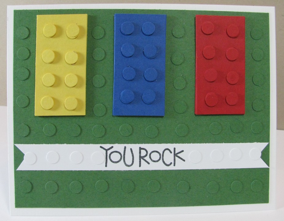
For my card, I chose to go with the "boy" theme and made another lego (tm) card:
I made a similar one back in February, but this time I went for the full lego look, with lots and lots of punched circles to simulate the lego board.
No I don't know if a young boy would get the "You Rock" sentiment, but his Mom sure would. :)
The rectangles are 1"x2" and are stacked 5 high. The circles are a 1/4" circle punch, and are stacked 3 high on top of each lego, but only 1 high on the green and white pieces. Hey, I got tired.
Now it's YOUR turn! Go into your stash and dig up something masculine or boyish and make a card, then come back to Shopping Our Stash and link us up so we can see what you've made!
Thanks for stopping by!
Subscribe to:
Posts (Atom)